Statistical analysis#
1. Introduction#
During this section, we will cover some common statistical analyses that are conducted in eDNA metabarcoding research. The statistical tests employed can vary widely and will mainly depend on the experimental design and research questions. Due to the breadth of statistical tests and the specificity based on the experimental design, we will be providing more of an introduction to the statistical analysis whereby we will focus on some key concepts, rather than providing a full breakdown of the statistical analysis of metabarcoding data.
Before we start with the statistical analysis, it is essential to keep an overview of the experimental design of our data. For the larger study, we want to examine how fish community composition changes across a latitudinal gradient in Japan, with particular interest in assessing evidence for tropicalisation, i.e., the poleward spread of tropical species due to ocean warming. For this tutorial dataset, we have water samples collected at various sites across Amami island, covering 2 distinct regions (north and south). The north region consists of 6 sampling locations, including Akakina, Asan, Imaizaki, Kurasaki, Sakibaru, and Sani. The south region consists of 5 sampling locations, including Ashiken, Edateku, Heda, Taen, and Yadon. Within each sampling location, 3 water samples were collected.
All of this means that we have 3 eDNA samples per location and 11 locations = 33 samples.
For the statistical comparison, we could investigate differences between all locations with samples as replicates. We could also generate a semi-quantitative dataset through an incidence-based approach by combining water samples within a location and compare the north region vs. the south region.
2. Summary stats#
2.1 Read and ASV numbers#
One of the first things we will do is to generate some numbers summarising the data. This information is usually provided in the first couple of paragraphs of the results section in a metabarcoding manuscript. Stats that are frequently included are total read count prior and post quality filtering, the average read number per sample and per group, as well as the minimum and maximum values, the number of ASVs, the most abundant and most frequently detected ASVs, read count and ASV number in negative controls, sample drop out, etc.
Most of these numbers have been reported in the previous sections, so I suggest going back to the respective section to look them up if needed. There are, however, a few additional numbers we can report on now that we have the finalised tables.
First, let’s prepare the R environment and read in the necessary data. For this, we will open a new R script and save it as statistical_analysis.R in the bootcamp directory.
## set up the working environment
setwd(file.path(Sys.getenv("HOME"), "Desktop", "bootcamp"))
list.files()

## load necessary R packages
for (pkg in c("tidyverse", "ggplot2", "car", "viridis", "UpSetR", "igraph", "ggraph",
              "scales", "ape", "picante", "patchwork", "MASS", "performance",
              "emmeans", "multcomp", "ggrepel", "ggforce", "indicspecies")) {
  if (!require(pkg, character.only = TRUE)) install.packages(pkg)
  library(pkg, character.only = TRUE)
  cat(pkg, "version:", as.character(packageVersion(pkg)), "\n")
}

## read data into R
metadata <- read.table(file.path("4.results", "metadata_filtered.txt"), header = TRUE, sep = '\t', row.names = 1, check.names = FALSE, comment.char = '')
count_table <- read.table(file.path("4.results", "count_table_filtered.txt"), header = TRUE, sep = '\t', row.names = 1, check.names = FALSE, comment.char = '')
taxonomy <- read.table(file.path("4.results", "taxonomy_filtered.txt"), header = TRUE, sep = '\t', row.names = 1, check.names = FALSE, comment.char = '')
phylo_tree <- read.nexus(file.path("6.phylotree", "asvs_aligned-tree.tree"))
One of the first things we can report on is the total number of reads and number of detected ASVs. We can easily do this by summing the values in the count table, as well as printing the number of rows in the count table, respectively.
## total number of reads and ASVs
sum(count_table)
nrow(count_table)
Output
> sum(count_table)
[1] 2993896
> nrow(count_table)
[1] 1695
Here, we can see that the final number of reads included in our count table is 2,993,896 reads and the final number of ASVs is equal to 1,695.
Next, we can determine the average number of reads per sample, as well as the standard error. For interest, we can look into the minimum and maximum values as well.
## average number of reads per sample
metadata$final_read_count <- colSums(count_table)[rownames(metadata)]
mean(metadata$final_read_count, na.rm = TRUE)
sd(metadata$final_read_count, na.rm = TRUE) / sqrt(sum(!is.na(metadata$final_read_count)))
min(metadata$final_read_count)
rownames(metadata)[metadata$final_read_count == min(metadata$final_read_count)]
max(metadata$final_read_count)
rownames(metadata)[metadata$final_read_count == max(metadata$final_read_count)]
Output
> mean(metadata$final_read_count, na.rm = TRUE)
[1] 90724.12
> sd(metadata$final_read_count, na.rm = TRUE) / sqrt(sum(!is.na(metadata$final_read_count)))
[1] 5027.811
> min(metadata$final_read_count)
[1] 52096
> rownames(metadata)[metadata$final_read_count == min(metadata$final_read_count)]
[1] "Sani_3"
> max(metadata$final_read_count)
[1] 161751
> rownames(metadata)[metadata$final_read_count == max(metadata$final_read_count)]
[1] "Asan_3"
From the output, we can see that the average number of reads across all samples is 90,724 ± 5,028. The minimum number of reads (52,096) was observed for Sani_3, while the maximum number of reads (161,751) was observed for Asan_3.
Next, we can investigate the same numbers for ASVs as well.
## average number of ASVs per sample
metadata$final_asv_count <- colSums(count_table > 0)[rownames(metadata)]
mean(metadata$final_asv_count, na.rm = TRUE)
sd(metadata$final_asv_count, na.rm = TRUE) / sqrt(sum(!is.na(metadata$final_asv_count)))
min(metadata$final_asv_count)
rownames(metadata)[metadata$final_asv_count == min(metadata$final_asv_count)]
max(metadata$final_asv_count)
rownames(metadata)[metadata$final_asv_count == max(metadata$final_asv_count)]
Output
> mean(metadata$final_asv_count, na.rm = TRUE)
[1] 359.0303
> sd(metadata$final_asv_count, na.rm = TRUE) / sqrt(sum(!is.na(metadata$final_asv_count)))
[1] 17.35287
> min(metadata$final_asv_count)
[1] 188
> rownames(metadata)[metadata$final_asv_count == min(metadata$final_asv_count)]
[1] "Akakina_3"
> max(metadata$final_asv_count)
[1] 521
> rownames(metadata)[metadata$final_asv_count == max(metadata$final_asv_count)]
[1] "Heda_3"
Here, we can see that the average number of ASVs per sample is 359 ± 17. The lowest number of ASVs (188) was observed in Akakina_3, while the maximum number of ASVs (521) was observed for Heda_3.
Besides read and ASV count per sample, it might also be of interest to group the data per sampling location.
## average number of reads and ASVs per location
location_info <- metadata %>%
  group_by(sampleLocation) %>%
  summarise(mean_reads = mean(final_read_count, na.rm = TRUE), se_reads = sd(final_read_count, na.rm = TRUE) / sqrt(n()),
            mean_asvs = mean(final_asv_count, na.rm = TRUE), se_asvs = sd(final_asv_count, na.rm = TRUE) / sqrt(n()))

# reads info
min(location_info$mean_reads)
location_info$sampleLocation[location_info$mean_reads == min(location_info$mean_reads)]
max(location_info$mean_reads)
location_info$sampleLocation[location_info$mean_reads == max(location_info$mean_reads)]

# ASV info
min(location_info$mean_asvs)
location_info$sampleLocation[location_info$mean_asvs == min(location_info$mean_asvs)]
max(location_info$mean_asvs)
location_info$sampleLocation[location_info$mean_asvs == max(location_info$mean_asvs)]
Output
> min(location_info$mean_reads)
[1] 63703
> location_info$sampleLocation[location_info$mean_reads == min(location_info$mean_reads)]
[1] "Sani"
> max(location_info$mean_reads)
[1] 139100.3
> location_info$sampleLocation[location_info$mean_reads == max(location_info$mean_reads)]
[1] "Asan"
> min(location_info$mean_asvs)
[1] 216
> location_info$sampleLocation[location_info$mean_asvs == min(location_info$mean_asvs)]
[1] "Akakina"
> max(location_info$mean_asvs)
[1] 477.3333
> location_info$sampleLocation[location_info$mean_asvs == max(location_info$mean_asvs)]
[1] "Sani"
The output here shows us that the lowest average number of reads (63,703) and ASVs (216) were observed in Sani and Akakina, respectively, while the highest average number of reads (139,100) and ASVs (477) were observed in Asan and Sani, respectively.
2.2 ASV exploration#
Besides read count and ASV count per sample, we can also investigate the most abundant (with regards to read count) and most frequently detected (occurrence count) ASVs. First, let’s add those data (total read count and occurrence count) into new columns in the taxonomy dataframe.
## ASV exploration
# add total read count and occurrence count to taxonomy
taxonomy$final_read_count <- rowSums(count_table)[rownames(taxonomy)]
taxonomy$pct_reads <- round(taxonomy$final_read_count / sum(count_table) * 100, 2)
taxonomy$occurrence_count <- rowSums(count_table > 0)[rownames(taxonomy)]
taxonomy$pct_occurrence <- round(taxonomy$occurrence_count / ncol(count_table) * 100, 2)
Now, let’s investigate the 10 most abundant and frequently detected ASVs by subsetting the taxonomy dataframe
# top 10 abundant ASVs
abundant_asvs <- taxonomy %>%
  slice_max(final_read_count, n = 10, with_ties = TRUE)

# top 10 frequent ASVs
frequent_asvs <- taxonomy %>%
  slice_max(occurrence_count, n = 10, with_ties = TRUE)
When investigating these dataframes, we can see that our data is dominated by ASV_1 (974,368 reads; 32.55%) and ASV_2 (842,055 reads; 28.13%) with regards to read count, taking up a total of 1,816,423 (60.68%) reads. The remaining 8 most abundant ASVs (ASV_3, ASV_8, ASV_5, ASV_7, ASV_14, ASV_9, ASV_15, and ASV_41) only take up a combined 368,573 reads or 12.31% within our data. When looking at the taxonomy assignment for ASV_1 and ASV_2, we can see that they are assigned to two different species within the same genus, i.e., Micromonas commoda and Micromonas pusilla. Micromonas is a widespread, very small-sized, prasinophyta alga that makes up a significant amount of picoplanktonic biomass and productivity in both oceanic and coastal regions. Hence, the abundance of these signals is not unsurprising, given live Micromonas organisms were likely captured on the filter, extracted, amplified using a universal COI primer set, and sequenced. The high abundance of picoplankton in COI metabarcoding data from water samples has been observed frequently and is one of the drawbacks of using a universal primer set that co-amplifies these organisms.
For the most frequently detected ASVs, we can see from the dataframe that we have 26 (1.53%) ASVs that were detected in all samples, including the two most abundant ASVs (ASV_1 and ASV_2). When looking at the taxonomic classifications of these 26 ASVs, we can see that, besides the two Micromonas species, we also detected an ascidian (Ascidia ahodori), and two other phytoplankton species (Phaeocystis globosa and Pelagomonas calceolata). The remaining ASVs only have poorly supported taxonomic classifications (i.e., BLAST percent identity and coverage values below 90) and, hence, are not reliable.
2.3 Taxa exploration#
When using universal primer sets for metabarcoding research, it is a common occurrence that some percentage of ASVs will be unclassified or receive a low-quality BLAST-hit. To investigate the quality of the BLAST-hits we received for our ASVs in this tutorial data, let’s plot the distribution of the percent identity values (note: BLAST is a local alignment, for which we set a threshold of query coverage to 50%, it might be needed to use global alignment values for a more accurate representation of this plot).
## Taxa exploration
# generate density plot for BLAST-hits
ggplot(taxonomy, aes(x = pident)) +
  geom_density(fill = "#377EB8", alpha = 0.3, color = "#377EB8", linewidth = 0.5, adjust = 1, na.rm = TRUE) +
  geom_vline(aes(xintercept = 100), color = "gray40", linetype = "dashed", linewidth = 0.5) +
  geom_vline(aes(xintercept = 95), color = "#806491", linetype = "dashed", linewidth = 0.5) +
  theme_minimal(base_size = 12) +
  theme(panel.grid.minor = element_blank(), panel.grid.major = element_line(linewidth = 0.2, color = "gray90"),
        plot.title = element_text(hjust = 0.5, face = "bold"), axis.line = element_line(color = "black")) +
  labs(title = "Density Distribution of BLAST-hits", x = "Percent Identity", y = "Density") +
  scale_y_continuous(expand = expansion(mult = c(0, 0.1))) +
  annotate("text", x = 100, y = Inf, vjust = 1, hjust = 1.05,
           label = paste0("Species cutoff (100%):\n", sum(taxonomy$pident >= 100, na.rm = TRUE), " (",
                          round(sum(taxonomy$pident >= 100, na.rm = TRUE) / nrow(taxonomy) * 100, 2), "%)"), color = "gray40") +
  annotate("text", x = 95, y = Inf, vjust = 2, hjust = 1.05,
           label = paste0("BLAST cutoff (95%):\n", sum(taxonomy$pident >= 95, na.rm = TRUE), " (",
                          round(sum(taxonomy$pident >= 95, na.rm = TRUE) / nrow(taxonomy) * 100, 2), "%)"), color = "#806491")
ggsave(filename = file.path("4.results", "blast_hit_distribution.png"), plot = last_plot(), bg = "white", dpi = 300)
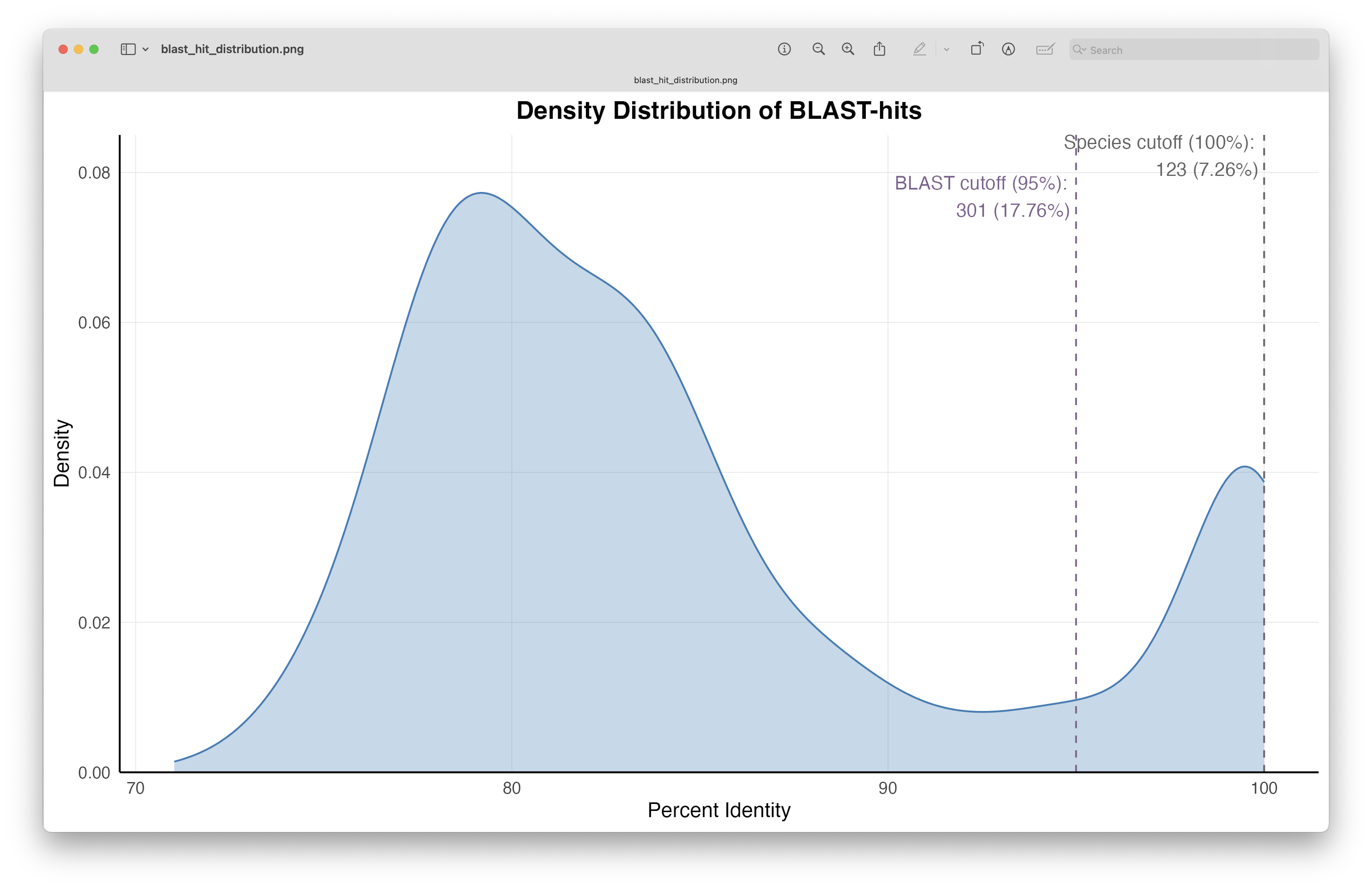
Fig. 67 : The distribution of the percentage identity values of the BLAST hits.#
The figure shows us that we have 123 (7.26%) ASVs with a 100% percent identity BLAST hit and, therefore, could be potentially assigned to species level (though query coverage will need to be taken into account for this as well). Furthermore, when we set a cutoff threshold of 95% for percent identity of BLAST hits, we see that we can assign a taxonomic ID to 301 or 17.76% of ASVs.
Let’s explore these high quality BLAST-hits a bit further. For this tutorial, we will subset the data for ASVs reaching a percent identity BLAST-hit of 100% and query coverage of at least 98%.
# subset high quality BLAST-hits
taxonomy_species <- taxonomy %>%
  filter(pident >= 100, qcov >= 98)
When subsetting the data based on percent identity and query coverage, we see that only 117 ASVs are included. We can now subset the count table as well, and reformat it, so that we can plot a simple stacked bar plot containing the read abundance of each species. Since we have over 100 taxa, it will be better to colour the bars based on a higher taxonomic level (we’ll use phylum in our case), and reorder or sort the bars based on the total number of reads to that higher taxonomic level.
count_species <- count_table %>%
  filter(rownames(.) %in% rownames(taxonomy_species)) %>%
  mutate(species = taxonomy_species$`matching species IDs`, phylum = taxonomy_species$phylum) %>%
  filter(!is.na(phylum)) %>%
  pivot_longer(cols = -c(species, phylum), names_to = "sample", values_to = "count") %>%
  group_by(phylum) %>%
  mutate(total_reads = sum(count)) %>%
  ungroup() %>%
  mutate(phylum = reorder(phylum, total_reads))

# plot raw bar graph
ggplot(count_species, aes(x = sample, y = count, fill = phylum)) +
  geom_col(position = "stack") +
  labs(x = "Sample", y = "Count", fill = "Phylum") +
  theme_minimal() +
  theme(axis.text.x = element_text(angle = 45, hjust = 1))
ggsave(filename = file.path("4.results", "species_raw_bar.png"), plot = last_plot(), bg = "white", dpi = 300)
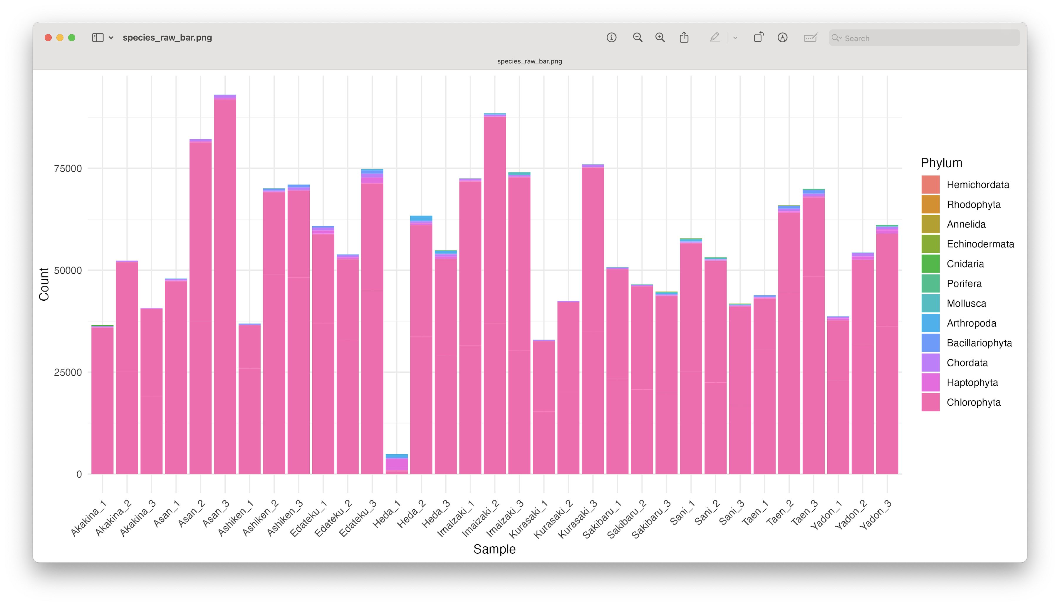
Fig. 68 : An unformatted stacked bar chart showing read count abundance of phyla.#
Since the number of sequences differ between samples, it might sometimes be easier to use relative abundances to visualise the data.
# plot rel abund bar graph
ggplot(count_species, aes(x = sample, y = count, fill = phylum)) +
  geom_col(position = "fill") +
  labs(x = "Sample", y = "Count", fill = "Phylum") +
  theme_minimal() +
  theme(axis.text.x = element_text(angle = 45, hjust = 1))
ggsave(filename = file.path("4.results", "species_rel_abund_bar.png"), plot = last_plot(), bg = "white", dpi = 300)
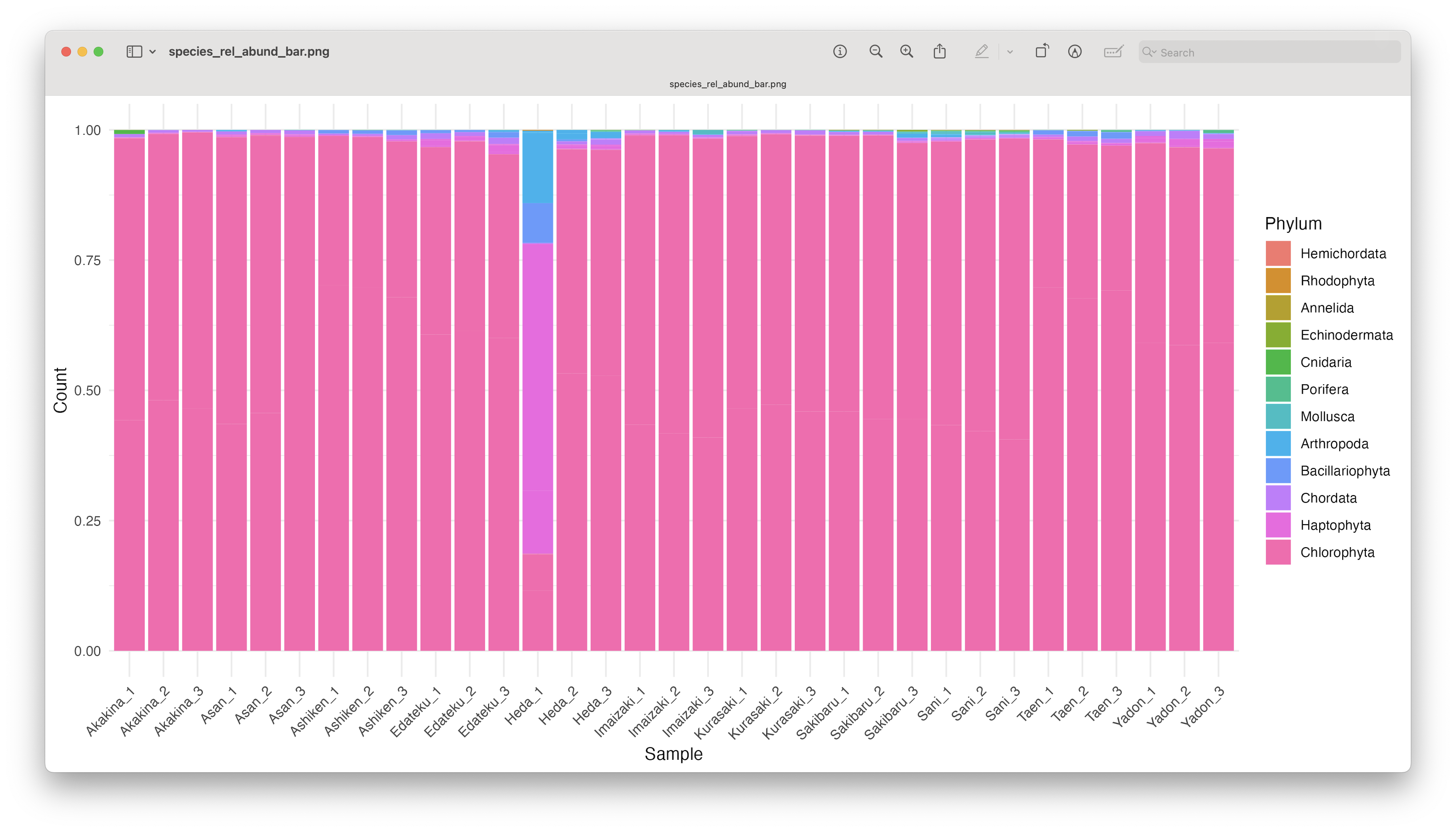
Fig. 69 : An unformatted relative abundant stacked bar chart showing read count abundance of phyla.#
While we can start to see that most samples show a similar pattern, except for Heda_1, sometimes it is easier to group the samples to reduce the number of bars in the plot.
# combine samples per location
metadata <- metadata %>%
  mutate(sample = rownames(.))
count_location <- count_species %>%
  left_join(metadata %>% dplyr::select(sample, sampleLocation), by = "sample") %>%
  group_by(sampleLocation, species, phylum) %>%
  summarise(total_count = sum(count), .groups = "drop") %>%
  group_by(phylum) %>%
  mutate(total_reads = sum(total_count)) %>%
  ungroup() %>%
  mutate(phylum = reorder(phylum, total_reads))

# plot rel abund bar location
ggplot(count_location, aes(x = sampleLocation, y = total_count, fill = phylum)) +
  geom_col(position = "fill") +
  labs(x = "Location", y = "Relative Abundance", fill = "Phylum") +
  theme_minimal() +
  theme(axis.text.x = element_text(angle = 45, hjust = 1))
ggsave(filename = file.path("4.results", "location_rel_abund_bar.png"), plot = last_plot(), bg = "white", dpi = 300)
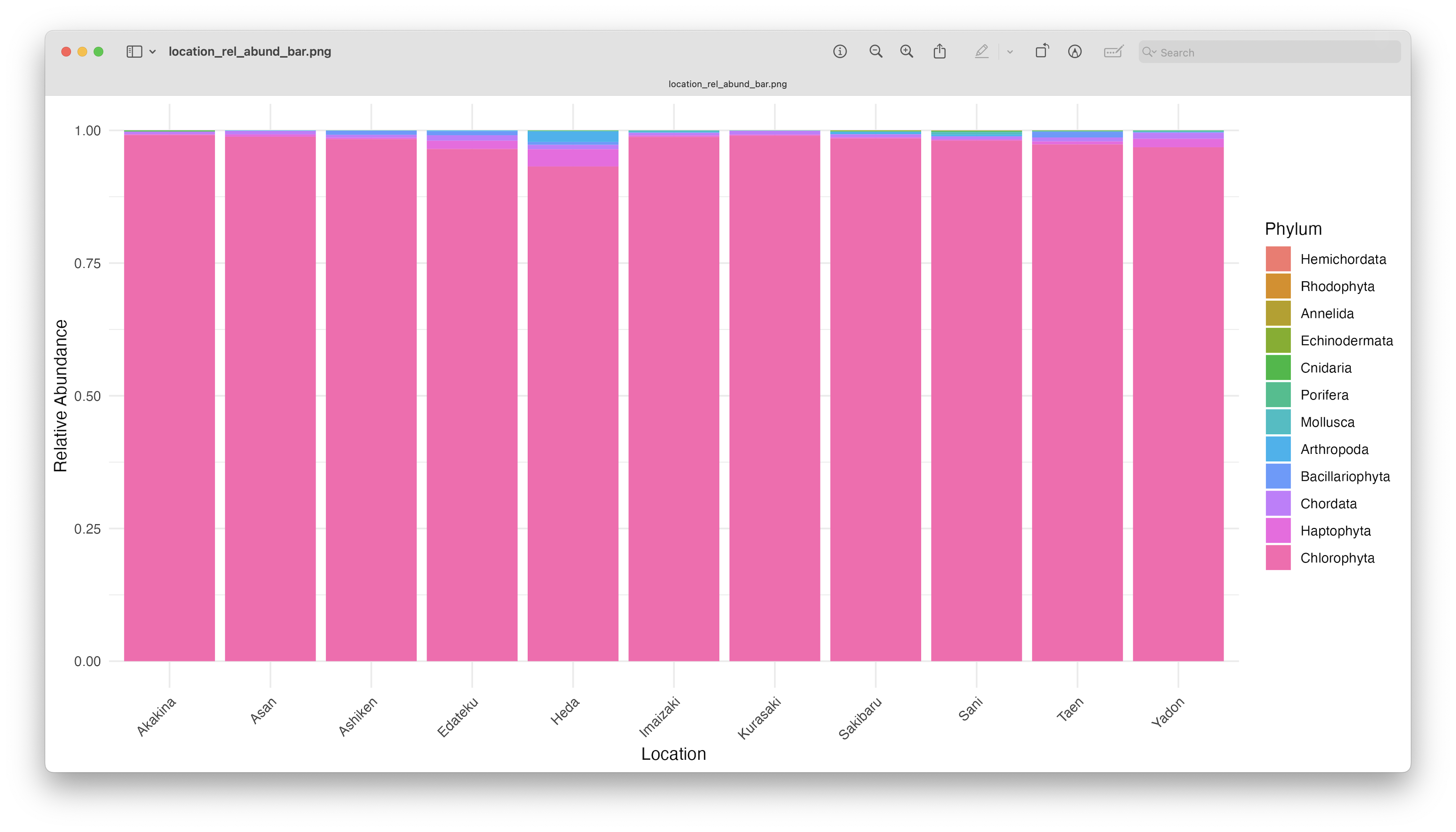
Fig. 70 : An unformatted relative abundant stacked bar chart showing read count abundance of phyla per location.#
As you can see, the graphs are easier to interpret when grouped by location, due to the limited number of stacked bars. The high abundance of Chlorophyta, however, is potentially still masking any differences between samples. Furthermore, it might also sstill be difficult to identify which phyla or species are occurring in only one sampling location, due to the number of species detected and the number of colours used. One “trick” we can employ, is to plot the data per phylum or species for all locations. For the tutorial, we will generate the plot per phylum for easy viewing (note: we use the scales = "free_y" option to eliminate the issue of the highly abundant Chlorophyta phylum). To generate the species plot, simply change facet_wrap(~phylum, scales = "free_y") to facet_wrap(~species, scales = "free_y").
# plot per phylum for easy visualisation
ggplot(count_location, aes(fill = sampleLocation, y = total_count, x = sampleLocation)) +
  geom_bar(position = 'dodge', stat = 'identity') +
  scale_fill_viridis(discrete = TRUE, option = "E") +
  ggtitle("Graphing data per phylum") +
  facet_wrap(~phylum, scales = "free_y") +
  theme(legend.position = "top", axis.text.x = element_text(angle = 90, hjust = 1)) +
  xlab("")
ggsave(filename = file.path("4.results", "per_phylum_bar.png"), plot = last_plot(), bg = "white", dpi = 300)
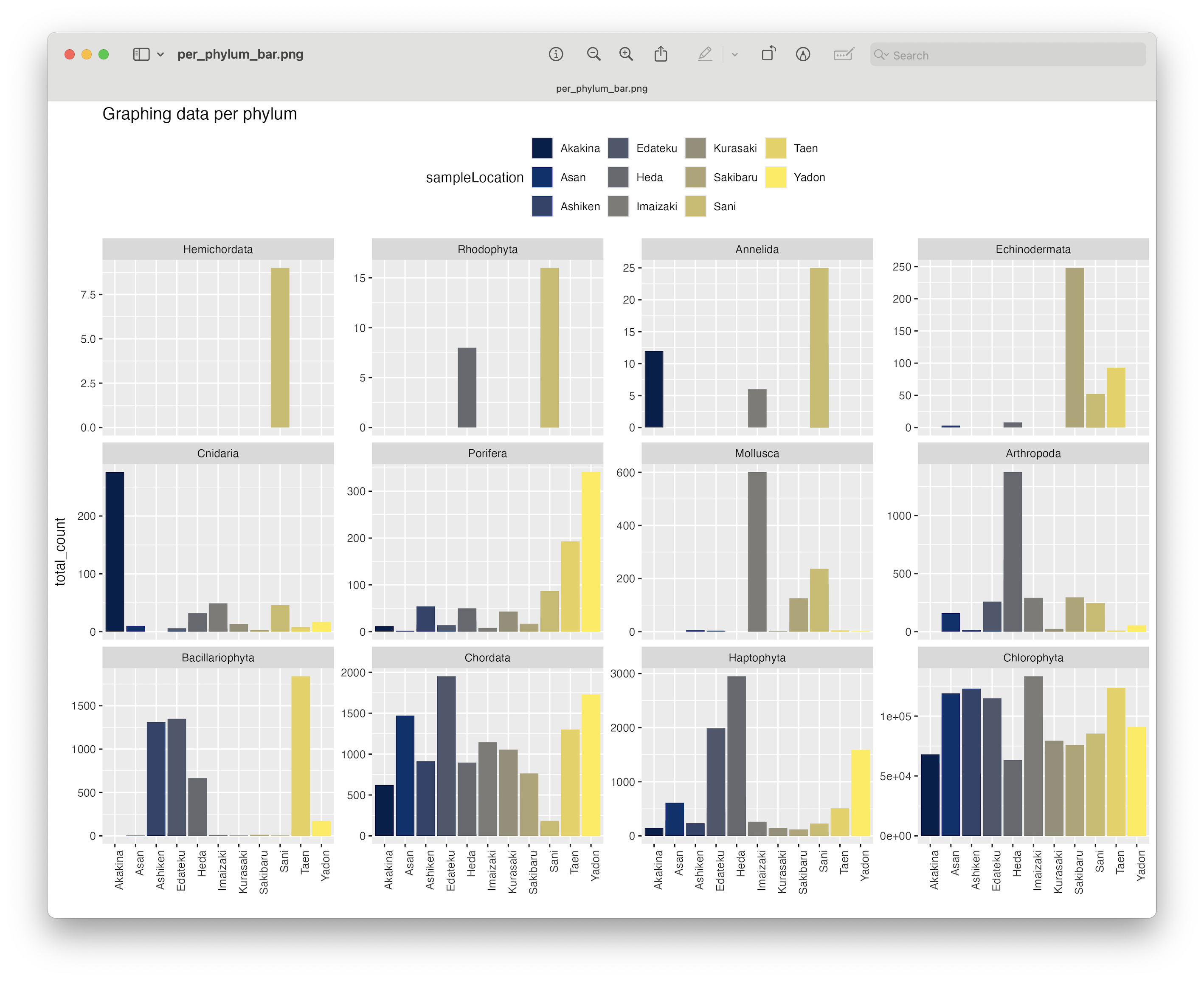
Fig. 71 : A formatted bar chart showing phyla abundance per location.#
Interestingly, when plotting the relative abundance, we will indirectly transform the data to presence-absence, which will aid significantly in distinguishing presence or absence for phyla between sampling locations.
# plot rel abund per phylum for easy visualisation
ggplot(count_location, aes(fill = sampleLocation, y = total_count, x = sampleLocation)) +
  geom_bar(position = 'fill', stat = 'identity') +
  scale_fill_viridis(discrete = TRUE, option = "E") +
  ggtitle("Graphing data per phylum") +
  facet_wrap(~phylum, scales = "free_y") +
  theme(legend.position = "top", axis.text.x = element_text(angle = 90, hjust = 1)) +
  xlab("")
ggsave(filename = file.path("4.results", "per_phylum_rel_abund_bar.png"), plot = last_plot(), bg = "white", dpi = 300)
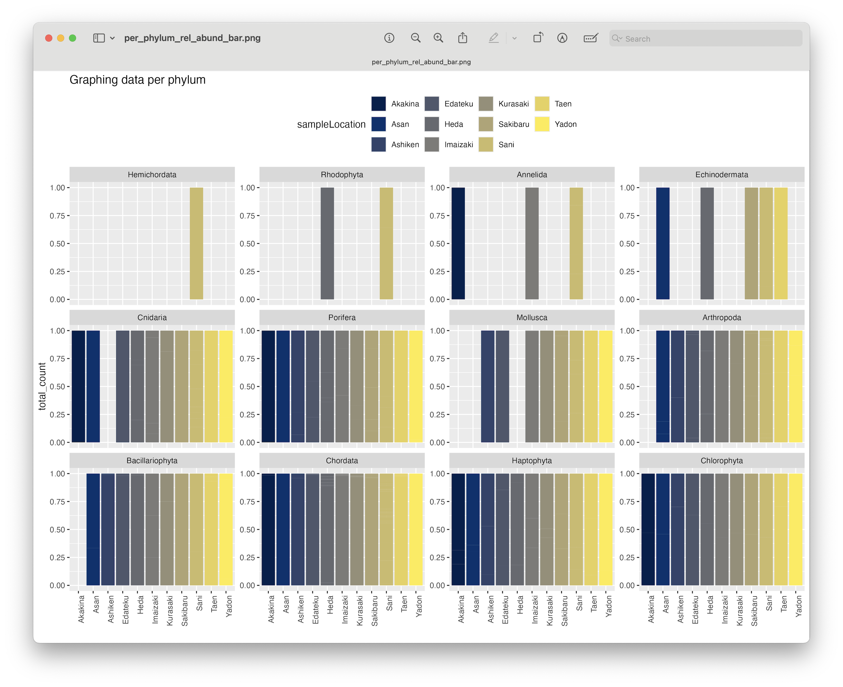
Fig. 72 : A formatted bar chart showing phyla relative abundance per location.#
From this plot, we can clearly se that the Chlorophyta, Haptophyta, Chordata, and Porifera phyla were detected at all locations.
Further exploration
What we’ve shown thus far is, of course, only a very brief overview of some data exploration steps. We suggest you explore this data further at a more interesting taxonomic level compared to phylum, focus on species of interest, or to incorporate a larger proportion of the data by relaxing the BLAST-hit filtering thresholds we’ve used in this example.
3. Alpha diversity#
3.1 Introduction#
In short, alpha diversity is the characterisation of diversity within a site. Researchers use this characterisation to quantify how diverse different systems are. For metabarcoding data, which does not hold true abundance information as the corrleation between eDNA signal strenght and species abundance is weak at best, scientists mainly focus on the simplest approach, i.e., species richness. Unlike for example Shannon or Simpson, species richness only considers the presence or absence of a species and disregards differentially weighing abundant and rare species.
Within alpha diversity, metabarcoding studies primarily incorporate Taxonomic Diversity (TD). However, by generating phylogenetic trees, as we’ve done in the last section, Phylogenetic Diversity (PD) can also be investigated. Recently, there has been a push to incorporate PD in metabarcoding studies. While TD is the most quantified measure of diversity, it gives an incomplete information befause the evolutionary history underlying spatial patterns is ignored. Since many decades, scientists have recognised that many ecological patterns are processes not independent of the evolution of the lineages involved in generating these patterns. Hence, the push to include PD in metabarcoding studies. For more information on PD, we recommend these two publications from Kling et al., 2018 and Alberdi & Gilbert, 2019.
Hill numbers
We also want to point you to the Hill number framework. Alpha diversity investigations of metabarcoding data can be significantly expanded using this single statistical framework that includes species richness, Shannon index, and Simpson index. This approach, however, requires metabarcoding data to be transformed using a so-called incidence-based approach. This approach works by transforming the data set to presence-absence and combining multiple samples from the same site/treatment to obtain the relative abundance information. For more information, we can have a look at the figure below. I also strongly suggest reading the excellent paper by Alberdi & Gilbert, 2019, which covers all of this in much more detail and in context of a metabarcoding approach. They also provide all the essential citations of the original statistical framework development.
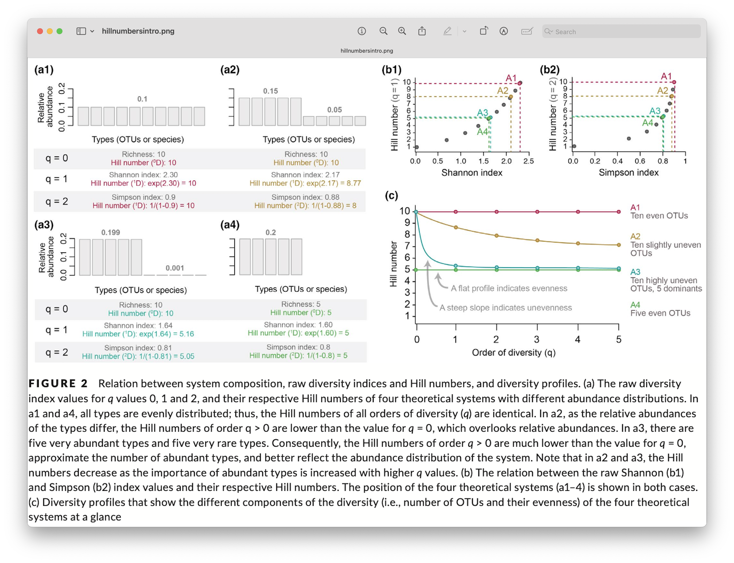
Fig. 73 : Introduction to the Hill number statistical framework. Copyright: Alberdi & Gilbert, 2019.#
It should be noted, however, that this data transformation requires an extra level of replication build into the experimental design. For our tutorial data, for example, we would need to transform a single sample to presence absence (0 for absence and 1 for presence). We, then, combine the three samples within a location to create the relative abundance measurement. For example, when an ASV is detected in 3 samples it will receive a value of 3, while a single detection of an ASV across all three samples will receive a value of 1. This approach, however, eliminates the current replication at the location level (we went from 3 replicates to 1 sample per location). If you’d be interested in comparing all locations, it would be statistically impossible due to the lack of replication, i.e., you would be comparing a single sample at each location with each other. A potential solution to this problem for our tutorial data since the locations are grouped into 2 regions, is to statistically compare the regions with each other, as the north region has 6 samples (locations) and south region has 5 samples (locations). If you would like to use this approach while still being able to compare all locations, it would require the collection of multiple grouped samples within a location. Hence, the extra level of replication required for this data transformation.
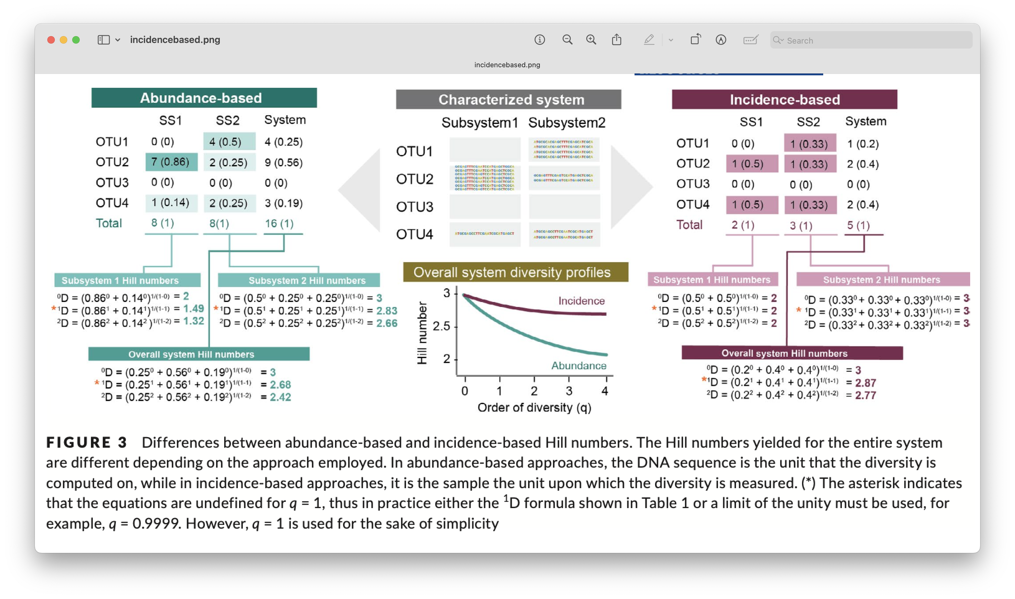
Fig. 74 : Introduction to incidence-based data transformation. Copyright: Alberdi & Gilbert, 2019.#
3.2 PD and SR#
When investigating Phylogenetic alpha Diversity (PD), it is important to check the phylogenetic tree before starting and ensure it is properly formatted. We can use the ape and picante R packages for this, which are the core packages for hypothesis testing in ecophylogenetics. The first check we can conduct is to determine if the tree if fully resolved or if polytomies (i.e., more than two ASVs originating from the same node in a tree; or an unresolved clade) are present. It is important to check this, as some phylogenetic analyses are not able to handle polytomies. We can use the is.binary() function in ape.
## Alpha diversity
# format data to fit the analysis
is.binary(phylo_tree)
Output
> is.binary(phylo_tree)
[1] TRUE
From the output, we can see that our phylogenetic tree is indeed fully resolved. If this were not the case for your data, you can use the multi2d() function to randomly resolve polytomies.
The next check before proceeding to our analysis, is to ensure that bot hthe community (count table) and phylogenetic data (phylogenetic tree) match. For this, the names of the tips should match the ASV names in the dataset. This also means that ASVs present in one dataset should not be absent in the other. First, we need to transpose our count table for formatting purposes. Then, we can use the all() base R function to check if the names are the same between the count table and the phylogenetic tree.
alpha_table <- as.data.frame(t(count_table))
all(sort(phylo_tree$tip.label) == sort(colnames(alpha_table)))
all(phylo_tree$tip.label == colnames(alpha_table))
Output
> all(sort(phylo_tree$tip.label) == sort(colnames(alpha_table)))
[1] TRUE
> all(phylo_tree$tip.label == colnames(alpha_table))
[1] FALSE
The output shows us that while all names are matching, they aren’t correctly ordered at the moment. To match our count table and phylogenetic tree, we can use the match.phylo.comm() function from the picante R package.
phylo_tree_clean <- match.phylo.comm(phy = phylo_tree, comm = alpha_table)$phy
alpha_table_clean <- match.phylo.comm(phy = phylo_tree, comm = alpha_table)$comm
all(phylo_tree_clean$tip.label == colnames(alpha_table_clean))
Output
> all(phylo_tree_clean$tip.label == colnames(alpha_table_clean))
[1] TRUE
The all() check after data matching tells us that we are ready for calculating Species Richness (or number of ASVs) and Phylogenetic Diversity (PD). In today’s tutorial, we will be using the Faith’s PD metric, a simple method to measure evolutionary diversity by summing the branch length of all co-occurring species in a given site, from the tips to the root of the phylogenetic tree. Higher Faith’s PD values are calculated for communities that have more evolutionary divergent taxa and an older history, while lower Faith’s PD values represent assemblages that have taxa with a more recent evolutionary history. We can calculate Faith’s PD using the pd() function in the picante R package. This function will also return the SR values we need for TD.
# calculate Faith's PD and species richness (SR)
alpha.PD <- pd(samp = alpha_table_clean, tree = phylo_tree_clean, include.root = FALSE)
One issue with Faith’s PD worth mentioning is the correlation with SR, i.e., higher total branch lengths are provided when more ASVs are present in a location. Hence, interpreting Faith’s PD across locations that have different SR can be complicated. While there are ways to overcome this, through randomisations and null models, this is outside the scope if this workshop but definitely worth checking out. For now, we can check the correlation using a Pearson’s correlation test and plotting SR against PD values.
# check SR and PD correlation
cor.test(alpha.PD$PD, alpha.PD$SR)
plot(alpha.PD$PD, alpha.PD$SR, xlab = 'Phylogenetic Diversity', ylab = 'Species Richness', pch = 16)
Output
Pearson's product-moment correlation

data:  alpha.PD$PD and alpha.PD$SR
t = 15.441, df = 31, p-value = 4.187e-16
alternative hypothesis: true correlation is not equal to 0
95 percent confidence interval:
 0.8823690 0.9705707
sample estimates:
      cor
0.9407124
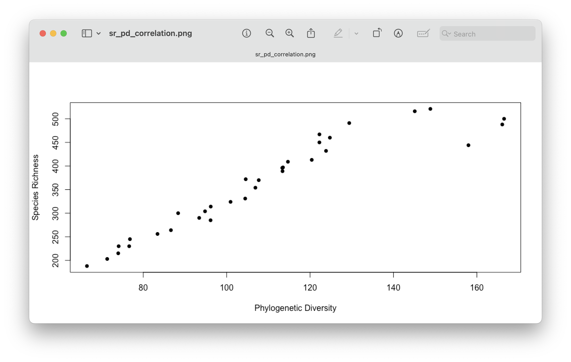
Fig. 75 : Visualising the correlation between Species Richness and Faith’s PD.#
3.3 Visualisation#
For now, let’s visualise the differences in Faith’s PD and SR between locations using boxplots. First, we will have to merge the resulting SR and PD columns with the metadata.
# add PD and SR to metadata
metadata <- merge(metadata, alpha.PD[c("PD", "SR")], by = "row.names", all.x = TRUE)
rownames(metadata) <- metadata$Row.names
metadata$Row.names <- NULL
Next, we can generate the boxplots using ggplot2.
# prepare for plotting
metadata$sampleLocation <- factor(metadata$sampleLocation,
                                  levels = c("Akakina", "Asan", "Imaizaki", "Kurasaki", "Sakibaru", "Sani",
                                             "Ashiken", "Edateku", "Heda", "Taen", "Yadon"))
metadata <- metadata %>%
  mutate(region = case_when(
    sampleLocation %in% c("Tatsugo", "Sani", "Gamo", "Imaizaki", "Asan", "Sakibaru", "Akakina", "Kurasaki") ~ "north",
    sampleLocation %in% c("Yadon", "Taen", "Ashiken", "Edateku", "Heda") ~ "south",
    TRUE ~ NA_character_))
metadata$region <- factor(metadata$region)
sample_colors <- c("Akakina" = "#EAE0DA", "Asan" = "#A0C3D2", "Ashiken" = "#E7C8C0", "Edateku" = "#B5C7A4",
                   "Gamo" = "#D4BBDD", "Heda" = "#F2D7A7", "Imaizaki" = "#A2D9D1", "Kurasaki" = "#DFA7A7", "Sakibaru" = "#C5D0E6",
                   "Sani" = "#D9C5A0", "Taen" = "#B7D9C4", "Tatsugo" = "#E3B7D1", "Yadon" = "#A8C6D9")
sample_shape <- c("north" = 22, "south" = 21)

# generate the SR boxplot
boxplot.SR <- ggplot(metadata, aes(x = sampleLocation, y = SR)) +
  geom_boxplot(aes(fill = sampleLocation, alpha = 0.5), outlier.shape = NA, show.legend = FALSE) +
  geom_point(aes(shape = region, fill = sampleLocation), position = position_jitterdodge(jitter.width = 3), size = 4, colour = "black", show.legend = TRUE) +
  scale_fill_manual(values = sample_colors, guide = "none") +
  scale_shape_manual(values = sample_shape, name = "Region") +
  scale_alpha(guide = "none") +
  theme_minimal(base_size = 12) +
  labs(title = "SR and PD alpha diversity boxplot") +
  theme(panel.grid.major.x = element_blank(), legend.position = "top",
        plot.title = element_text(hjust = 0.5, face = "bold"),
        axis.title.x = element_blank(), axis.text.x = element_blank()) +
  guides(shape = guide_legend(override.aes = list(size = 2, fill = "black")))
boxplot.SR

boxplot.PD <- ggplot(metadata, aes(x = sampleLocation, y = PD)) +
  geom_boxplot(aes(fill = sampleLocation, alpha = 0.5), outlier.shape = NA, show.legend = FALSE) +
  geom_point(aes(shape = region, fill = sampleLocation), position = position_jitterdodge(jitter.width = 3), size = 4, colour = "black", show.legend = TRUE) +
  scale_fill_manual(values = sample_colors, guide = "none") +
  scale_shape_manual(values = sample_shape, guide = "none") +
  scale_alpha(guide = "none") +
  theme_minimal(base_size = 12) +
  theme(panel.grid.major.x = element_blank(), legend.position = "none")
boxplot.PD

boxplots <- boxplot.SR / boxplot.PD + plot_layout(guides = "keep")
boxplots
ggsave(filename = file.path("4.results", "alpha_boxplot.png"), plot = boxplots, bg = "white", dpi = 300)
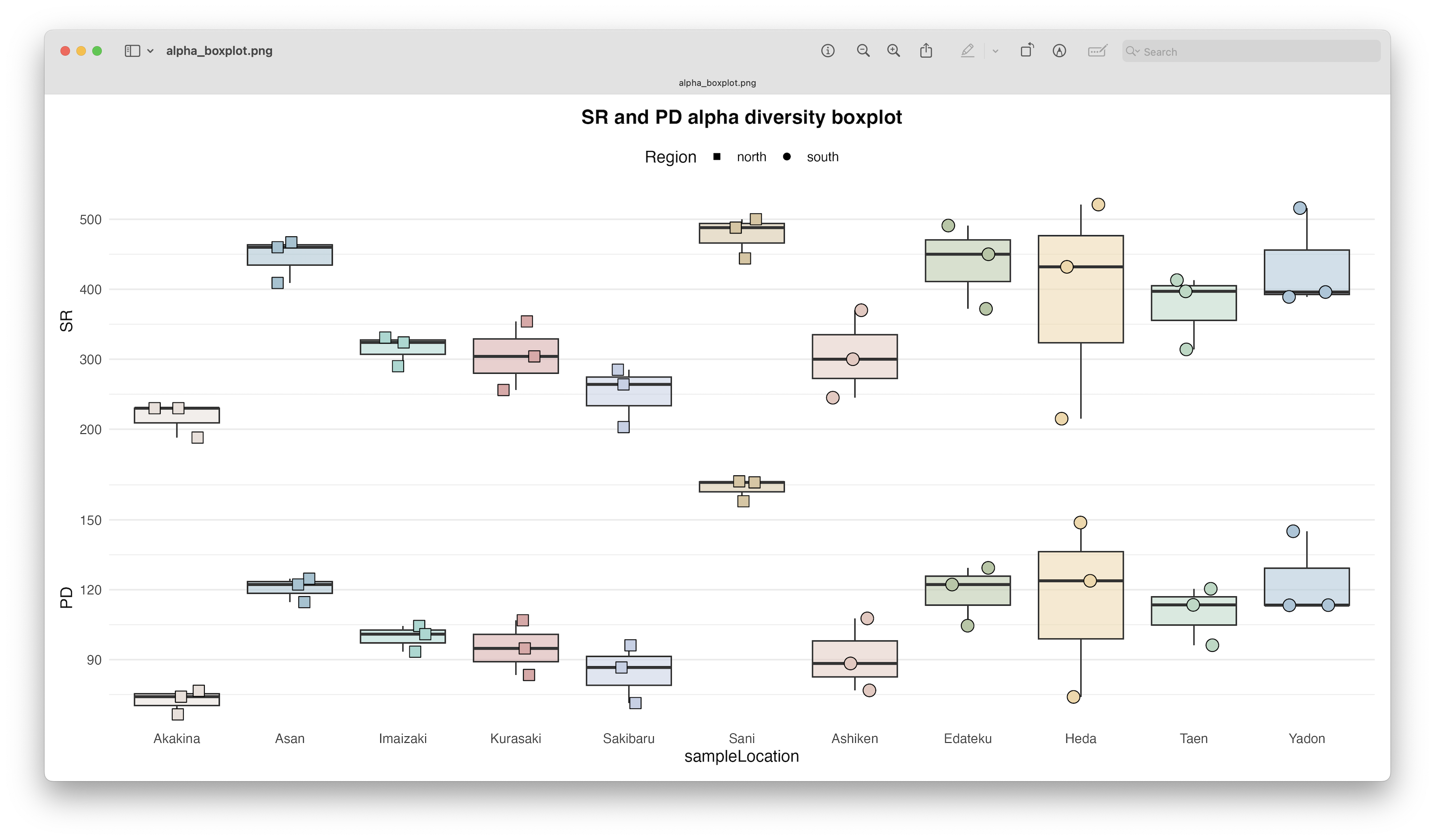
Fig. 76 : Alpha diversity boxplots per location depicting Species Richness (SR) and Phylogenetic Diversity (Faith’s PD).#
As mentioned before, we see a similar pattern between SR and PD, but more interestingly, we see quite big differences in alpha diversity between our locations. The highest alpha diversity is observed in Sani, while the lowest alpha diversity was observed in Akakina.
3.4 Significance testing#
To determine if there is a significant difference in alpha diversity, we can run a statistical test. For SR, which is count data, we can use a GLM to determine differences between locations. Since the data is overdispersed when using a Poisson distribution (code not shown), we will use the negative binomial model instead. First, we can run the model and check the assumptions.
# conduct negative binomial GLM to determine differences in SR between locations
# fit negative binomial model
model_sr <- glm.nb(SR ~ sampleLocation, data = metadata)

# check overdispersion
check_overdispersion(model_sr)

# check normality of residuals using QQ plot
qqnorm(resid(model_sr)); qqline(resid(model_sr))

# check homogeneity of variance
plot(model_sr, which = 1)
Output
# Overdispersion test

 dispersion ratio = 0.945
          p-value = 0.928

No overdispersion detected.
Once we verified all is good, we can print out the overall significance, as well as the pairwise comparison results. Additionally, we can make use of the cld() function in the multcomp R package to assign letters to each group, which can be added to the boxplot to show significant differences between locations.
# overall model significance
Anova(model_sr, type = 'III')

# post hoc pairwise comparisons
emmeans_sr <- emmeans(model_sr, pairwise ~ sampleLocation, adjust = "tukey", type = "response")
cld_results <- cld(emmeans_sr$emmeans, Letters = letters, adjust = "fdr")
cld_results
Output
Analysis of Deviance Table (Type III tests)

Response: SR
               LR Chisq Df Pr(>Chisq)
sampleLocation   80.217 10  4.552e-13 ***
---
Signif. codes:  0 ‘***’ 0.001 ‘**’ 0.01 ‘*’ 0.05 ‘.’ 0.1 ‘ ’ 1

 sampleLocation response   SE  df asymp.LCL asymp.UCL .group
 Akakina             216 19.8 Inf       167       280  a
 Sakibaru            251 22.7 Inf       194       324  ab
 Kurasaki            305 27.2 Inf       237       392   bc
 Ashiken             305 27.2 Inf       237       393   bc
 Imaizaki            315 28.0 Inf       245       405   bc
 Taen                375 33.0 Inf       292       481    cd
 Heda                389 34.2 Inf       303       499    cd
 Yadon               434 37.9 Inf       339       556     d
 Edateku             438 38.2 Inf       342       561     d
 Asan                445 38.8 Inf       348       570     d
 Sani                477 41.5 Inf       373       611     d

Confidence level used: 0.95
Conf-level adjustment: bonferroni method for 11 estimates
Intervals are back-transformed from the log scale
P value adjustment: fdr method for 55 tests
Tests are performed on the log scale
significance level used: alpha = 0.05
NOTE: If two or more means share the same grouping symbol,
      then we cannot show them to be different.
      But we also did not show them to be the same.
The results show a highly significant difference in SR between locations, with locations mainly split into 3 groups, including a low SR (Akakina and Sakibaru), mid SR (Kurasaki, Ashiken, Imaizaki, Taen, and Heda), and high SR (Yadon, Edateku, Asan, and Sani).
Since Faith’s PD is a continuous variable, we will use a linear model instead to determine significant differences between locations. Similar to SR, we will first fit the model and check the assumptions.
# conduct LM to determine differences in PD between locations
# fit LM
model_pd <- lm(PD ~ sampleLocation, data = metadata)

# check normality of residuals
shapiro.test(resid(model_pd))

# check normality of residuals using QQ plot
qqnorm(resid(model_pd)); qqline(resid(model_pd))

# check homogeneity of variance
plot(model_pd, which = 1)
bartlett.test(PD ~ sampleLocation, data = metadata)
Output
Shapiro-Wilk normality test

data:  resid(model_pd)
W = 0.94115, p-value = 0.07337

Bartlett test of homogeneity of variances

data:  PD by sampleLocation
Bartlett's K-squared = 14.895, df = 10, p-value = 0.136
All seems to be fine, though note the near-significance of the Shapiro-Wilk normality test. Hence, you could consider using a data transformation. For now, we’ll continue with printing the overall significance and pairwise comparisons.
# overall model significance
Anova(model_pd, type = 'III')

# post hoc pairwise comparisons
emmeans_pd <- emmeans(model_pd, pairwise ~ sampleLocation, adjust = "tukey")
cld_pd <- cld(emmeans_pd$emmeans, Letters = letters, adjust = "fdr")
cld_pd
Output
Anova Table (Type III tests)

Response: PD
                Sum Sq Df F value    Pr(>F)
(Intercept)    15728.3  1 62.8150 6.891e-08 ***
sampleLocation 18016.4 10  7.1953 6.045e-05 ***
Residuals       5508.6 22
---
Signif. codes:  0 ‘***’ 0.001 ‘**’ 0.01 ‘*’ 0.05 ‘.’ 0.1 ‘ ’ 1

 sampleLocation emmean   SE df lower.CL upper.CL .group
 Akakina          72.4 9.14 22     43.5      101  a
 Sakibaru         84.7 9.14 22     55.8      114  ab
 Ashiken          91.0 9.14 22     62.1      120  abc
 Kurasaki         95.0 9.14 22     66.2      124  abc
 Imaizaki         99.6 9.14 22     70.7      128  abc
 Taen            110.0 9.14 22     81.2      139   bc
 Heda            115.6 9.14 22     86.7      144   bc
 Edateku         118.7 9.14 22     89.9      148    c
 Asan            120.6 9.14 22     91.7      149    c
 Yadon           123.9 9.14 22     95.1      153    c
 Sani            163.5 9.14 22    134.7      192     d

Confidence level used: 0.95
Conf-level adjustment: bonferroni method for 11 estimates
P value adjustment: fdr method for 55 tests
significance level used: alpha = 0.05
NOTE: If two or more means share the same grouping symbol,
      then we cannot show them to be different.
      But we also did not show them to be the same.
Similar to SR, we have a highly significant result in alpha phylogenetic diversity between locations.
4. Beta diversity#
Besides the number of species within a site (alpha diversity), species composition or beta diversity is another important aspect of analysis within metabarcoding research. To analyse species composition between sites, we can use ordination and cluster visualisations to depict sample/site/treatment similarity or dissimilarity. PERMANOVA and PERMDISP, on the other hand, are the statistical tests to investigate significant differences between treatments based on species composition between treatments. Lastly, Indicator Species Analysis (ISA) allows us to identify which signals are driving the difference between groups.
Similar to alpha diversity, beta diversity can incorporate Taxonomic Diversity, as well as Phylogenetic Diversity, something we’ll explore during this tutorial.
4.1 Visualise ASVs across locations#
First, however, it is useful to visualise the overlap in ASV detection between the different locations. Traditionally, Venn diagrams have been used for this purpose. However, drawing Venn diagrams with 11 sections is impractical. Two alternative approaches to Venn diagrams when dealing with a larger number of sets (n > 3) are UpSet diagrams and network graphs. UpSet diagrams are best for showing intersection sizes without drawing overlapping circles and works by using a matrix format with bars to represent intersection frequencies. To draw UpSet diagrams, we can make use of the UpSetR R package. Network graphs, on the other hand, are best for highlighting shared elements between groups, whereby nodes are the groups (locations) and edges are the shared elements (ASVs) with thickness showing the overlap size. To draw network graphs, we can make use of the igraph R package and the ggraph R package.
So, let’s generate these plots now to look at the shared and unique ASVs across locations.
Before generating the plots, we need to reformat the data. In this case, we need to combine the metadata file with the count table, as we need to sum the samples by location (which will be our groups). Then, we will transform the data to presence-absence, as these graphs do not include information on ASV abundance or occurrence.
## Visualise shared/unique ASVs
# combine metadata and count_table to group per location
location_table <- t(count_table) %>%
  as.data.frame() %>%
  mutate(sample = rownames(.)) %>%
  left_join(metadata %>% dplyr::select(sample, sampleLocation), by = "sample") %>%
  group_by(sampleLocation) %>%
  summarise(across(-sample, ~ as.integer(sum(.x) > 0))) %>%
  column_to_rownames("sampleLocation") %>%
  t() %>% as.data.frame()
Next, we can call the upset() function in the UpSetR R package. To keep things tidy, we will only show the 30 most abundant intersections (more on this after we have generated the graph) using the nintersects = 30 parameter. Please note that we are only showing the default plot and many customisations are possible. For more information, I suggest you read the help documentation (?upset()) of the package.
# visualise through UpSet
upset(location_table, nsets = 11, nintersects = 30, order.by = "freq", text.scale = 1.2,
      mainbar.y.label = "Number of ASVs", sets.x.label = "Total number of ASVs")
png(filename = file.path("4.results", "upset.png"), width = 10, height = 6, units = "in", res = 300)
upset(location_table, nsets = 11, nintersects = 30, order.by = "freq", text.scale = 1.2,
      mainbar.y.label = "Number of ASVs", sets.x.label = "Total number of ASVs")
dev.off()
Fig. 77 : UpSet graph visualising shared/unique ASVs across locations.#
This graph contains several subplots, so let’s go over them in detail to help interpret UpSet plots. On the bottom left-hand side, we have the total number of ASVs per location represented as a bar graph. On the top right-hand side, we have the number of ASVs that belong to an intersection represented as a bar graph (only the 30 most abundant intersections are displayed). In the bottom right-hand side, we have the intersections, i.e., to which locations this belongs. For example, in our data set, the most abundant intersection consists of 220 ASVs only belonging to Sani (only coloured dot) and are not found in any other location. 100 ASVs, on the other hand, which is the second most abundant intersection, are found in all 11 locations (all 11 points are coloured).
From this graph, we can clearly see that, while there is a large number of ASVs that are shared between locations, there is also a large number of ASVs that are only present in a single location.
To generate a network graph, we have to reformat the data once again. First, we need to calculate the number of shared ASVs between locations and place these values in a matrix.
# visualise through network graph
# compute shared ASVs between locations
shared_asvs <- t(location_table) %*% as.matrix(location_table)
Next, we need to generate a network graph object from this matrix.
# create network graph
net <- graph_from_adjacency_matrix(shared_asvs, mode = "undirected", weighted = TRUE, diag = FALSE)
Then, we can generate the plot.
# circular layout with optimized spacing
ggraph(net, layout = "linear", circular = TRUE) +
  geom_edge_arc(aes(width = weight, alpha = weight), color = "steelblue", strength = 0.2, show.legend = FALSE) +
  geom_node_point(aes(size = 10), fill = "#E1F5FE", shape = 21, color = "white", stroke = 0.5, show.legend = FALSE) +
  geom_node_text(aes(label = name, angle = -((-node_angle(x, y) + 90) %% 180) + 90), size = 3, hjust = "outward", vjust = "outward", repel = FALSE) +
  scale_edge_width(range = c(0.5, 3), name = "Shared ASVs") +
  scale_size_continuous(range = c(4, 12), name = "Degree") +
  theme_void() +
  theme(legend.position = "bottom", plot.margin = unit(c(1,1,1,1), "cm"), panel.background = element_rect(fill = "white", color = NA)) +
  coord_fixed(clip = "off")
ggsave(filename = file.path("4.results", "network_graph.png"), plot = last_plot(), bg = "white", dpi = 300)
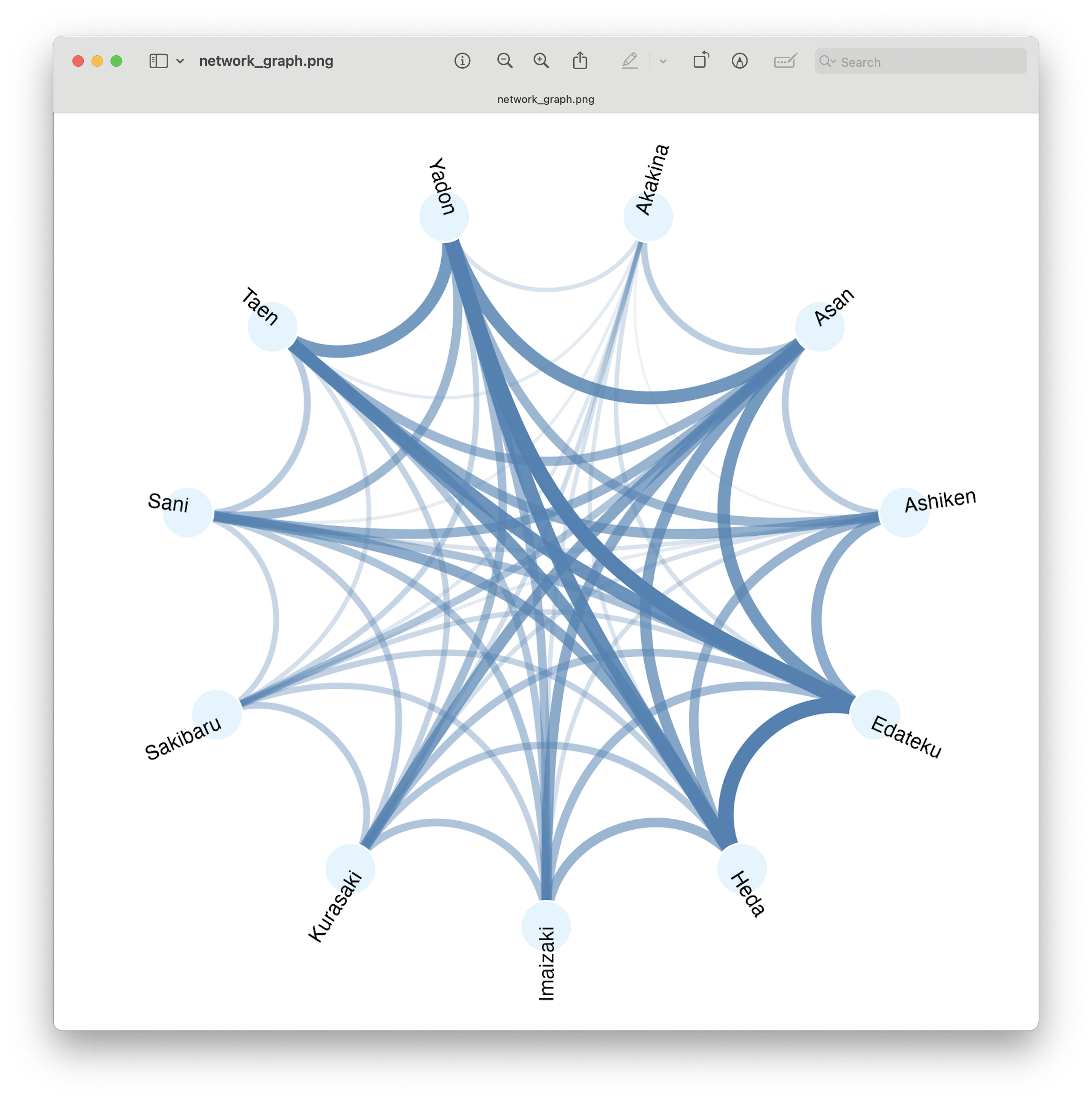
Fig. 78 : Network graph visualising shared/unique ASVs across locations.#
In this circular network graph, the dots represent the 11 sampling locations and the lines represent the connectedness between locations, with width and color linked to the number of ASVs shared.
From this graph, we can see the differing overlap in number of ASVs between locations. However, this plot is also impacted by the total number of ASVs within a location (look at how Akakina, the location with fewest total ASVs, also looks like the least shared ASVs). Finally, this plot also loses the information on unique ASVs, as only shared ASVs are taken into account in this plot.
To include unique ASVs, we can generate a so-called bipartite network graph, where we have two types of nodes, one for location and one for ASVs. We can, then, plot the lines to which ASV is linked to which location. For this graph, we need to slightly reformat the data again.
# reformat data for Bipartite Network Graph
edge_list <- location_table %>%
  rownames_to_column("ASV") %>%
  pivot_longer(cols = -ASV, names_to = "Location", values_to = "Present") %>%
  filter(Present == 1) %>%
  dplyr::select(-Present)
Next, we can create the network graph object again and plot the graph.
# create network
net <- graph_from_data_frame(edge_list, directed = FALSE)

# assign node types and scale
V(net)$type <- ifelse(V(net)$name %in% colnames(location_table), "Location", "ASV")
V(net)$degree <- igraph::degree(net)

# visualise using bipartite network graph
ggraph(net, layout = "fr") +
  geom_edge_link(alpha = 0.1, color = "gray80") +
  geom_node_point(aes(size = degree, color = type), show.legend = TRUE) +
  geom_node_text(aes(label = name, color = type), data = . %>% filter(type == "Location"), repel = TRUE, size = 3) +
  scale_color_manual(values = c("Location" = "steelblue", "ASV" = "grey40")) +
  scale_size(range = c(1, 8)) +
  theme_void()
ggsave(filename = file.path("4.results", "bipartite_network_graph.png"), plot = last_plot(), bg = "white", dpi = 300)
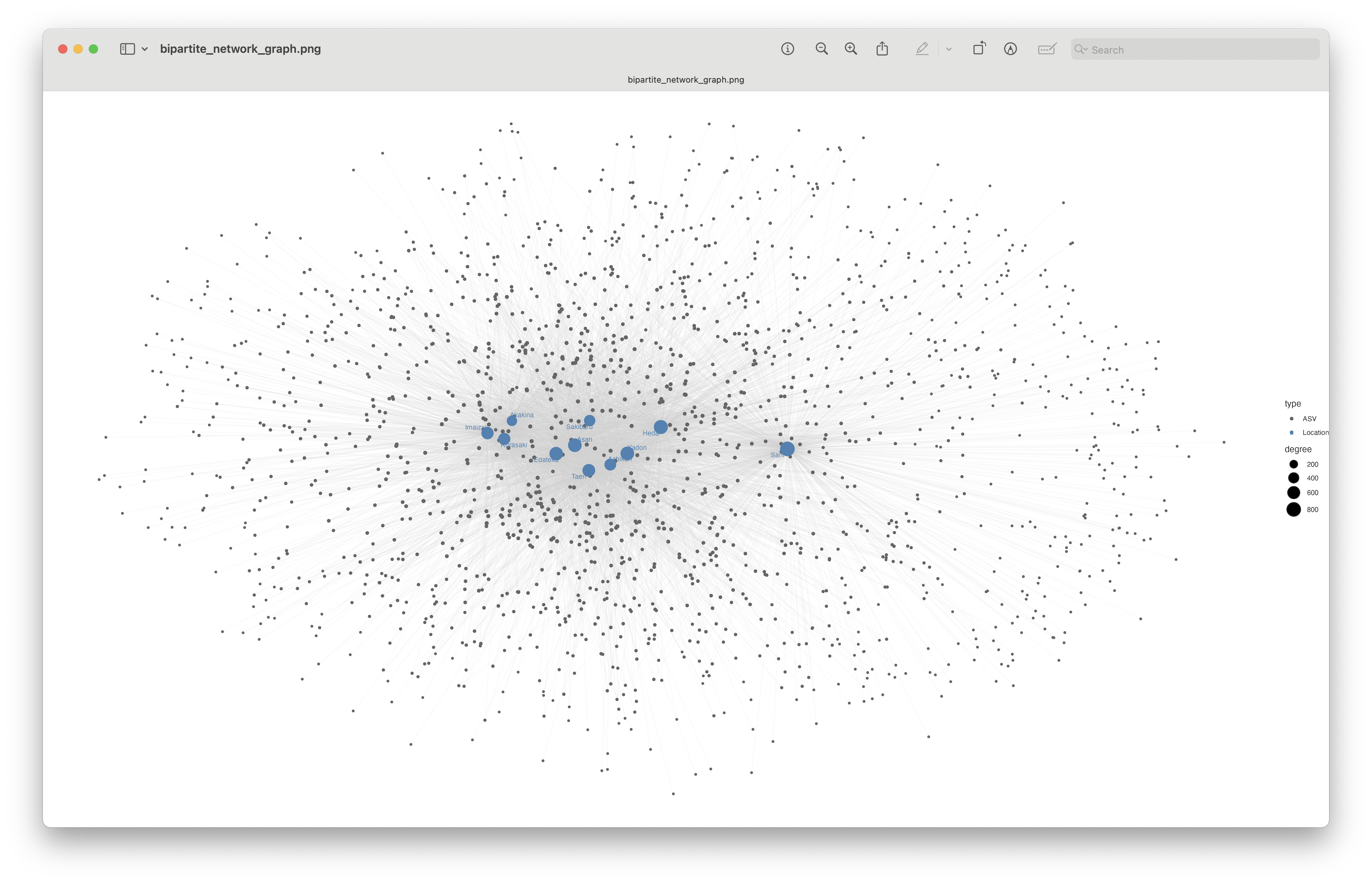
Fig. 79 : Bipartite network graph visualising shared/unique ASVs across locations.#
This plot is a bit difficult to visualise due to the large number of ASVs, but we can clearly see that the Sano location separates in the bipartite network graph, due to the large number of unique ASVs.
Optimise bipartite network graph
To further optimise the bipartite network graph, we could combine all ASVs that share the same location. For example, rather than 220 ASVs unique to Sano, you could have a single node, with a line represented by a weight of 220.
4.2 Ordination analysis (PCoA)#
Ordination is the multivariate analysis which aims to find gradients or changes in species composition across groups. Multivaraite species composition can be imaged as samples in multidimensional space, where every species represents its own axis. Because multidimensional space is not easy to disply, describe, or even imagine, it is worth reducing it into a few main dimensions while preserving the maximum information. In ordination space, objects that are closer together are more similar, and dissimilar objects are more separated from each other.
There are multiple ordination methods available. Some of the most common ones are Principal Components Analysis (PCA), Principle Coordinates Analysis (PCoA), and Non-metric MultiDimensional Scaling (NMDS). Although many other ordination methods exist as well, including RDA (Redundancy Analysis), CAP (Canonical Analysis of Principle coordinates), and dbRDA (Distance Cased Redundancy Analysis) The choice of ordination methods depends on (1) the type of data and (2) the similarity distance matrix you intend to use. Some methods, such as PCA are restricted to using Euclidean distance matrices, while NMDS and PCoA are able to use any distance matrix. The choice of distance matrix, is usually dependent on the type of data. For metabarcoding data, which contains lots of null values, Bray-Curtis (abundance or relative abundance) and Jaccard (presence-absence) are frequently chosen. Both these options are non-euclidean distances, which is why most metabarcoding studies opt for PCoA and NMDS ordination methods. For more information about ordination, please visit this blog or this review article.
For this tutorial, we will focus on Principal Coordinates Analysis or PCoA, which is a frequently used method in metabarcoding studies. PCoA is also known as Multi-Dimensional Scaling (MDS) and aims to preserve the original pairwise distances as closely as possible while transforming the data into low-dimensional space. PCoA is a metric technique, thereby assuming a linear relationship between the original distances and the distances in the ordination space. If the distance measure used is Euclidean, PCoA is identical to PCA.
First things first, since read count doesn’t necessarily portray species abundance, let’s transform our data to presence absence. We can use the alpha_table_clean dataframe, as this is already matching with the phylo_tree_clean object.
## ordination analysis (PCoA)
# transform alpha_table_clean to presence absence
beta_table_clean_pa <- as.data.frame((alpha_table_clean > 0) * 1)
Next, we need to calculate the distance matrices we will use for our ordination. For PD, we will choose the Unweighted UniFrac distance implemented in the unifrac() function from the picante R package. For TD, we will use the Jaccard distance, as this fits well with the presence absence data transformation. We can use the vegdist() function in the vegan R package.
## calculate the uniFrac and Jaccard distance matrices
total_unifrac_distance <- unifrac(beta_table_clean_pa, phylo_tree_clean)
total_jaccard_distance <- vegdist(beta_table_clean_pa, method = "jaccard")
Then, we can perform the PCoA ordination on both distance matrices. We can use the wcmdscale() function in the vegan R package for this step.
## perform PCoA ordination on both distance matrices
total_unifrac_pcoa <- wcmdscale(as.dist(total_unifrac_distance), eig = TRUE)
total_jaccard_pcoa <- wcmdscale(as.dist(total_jaccard_distance), eig = TRUE)
Identical PD and TD code
Note that from here onwards, the code will be identical between the PD and TD datasets. For conciseness, we will only continue with the PD dataset. Howevever, if you would like to analyse the TD dataset, all you would need to do is to change the unifrac portion of the variable name to jaccard.
Once we have conducted the ordination, we can have a look at the eignevalues. Eigenvalues represent the amount of variation explained by each axis or dimension in the ordination plot. The larger the eigenvalue, the more important that axis is in capturing the variability in the original data. We can plot a Scree plot to visualise the importance of each axis in our data set.
## generate scree plots
total_unifrac_eigen <- data.frame(Inertia = total_unifrac_pcoa$eig / sum(total_unifrac_pcoa$eig) * 100, Axes = seq_along(total_unifrac_pcoa$eig))
total_unifrac_scree <- ggplot(data = total_unifrac_eigen, aes(x = factor(Axes), y = Inertia)) +
  geom_bar(stat = 'identity') +
  theme_classic() +
  xlab('Axes') +
  ylab('Inertia %')
total_unifrac_scree
ggsave(filename = file.path("4.results", "scree.png"), plot = total_unifrac_scree, bg = "white", dpi = 300)
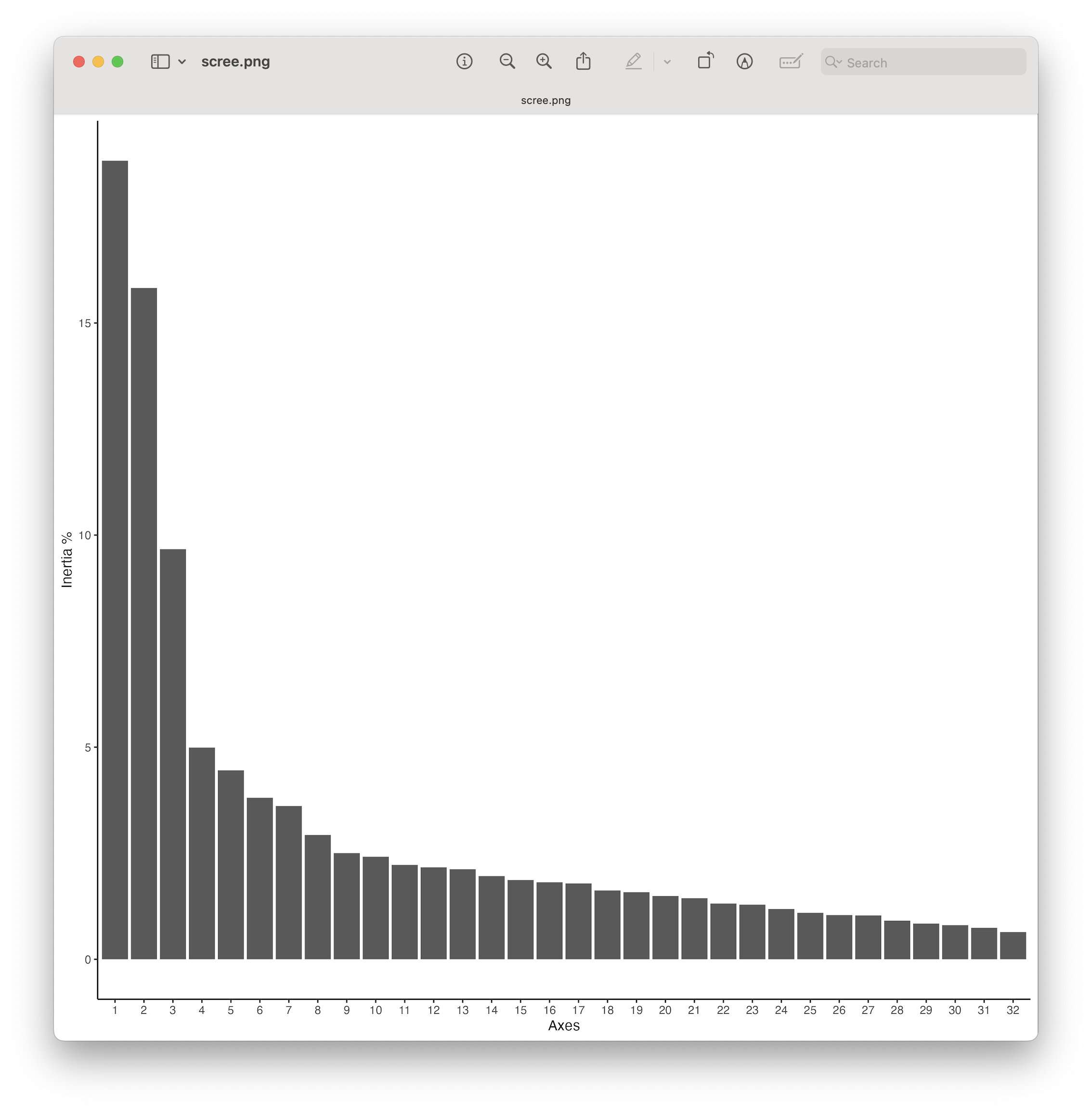
Fig. 80 : The Scree plot providing information about the percentage of variation explained on each axis.#
From the plot, we can see that there are a couple of axes that explain a large amount of the variation, followed by a tail end of axis explaining only a low amount of the variation. This is a typical pattern observed in metabarcoding data ordination. While ordination plots, which we’ll generate next, mainly focus on the first 2 axes, our Scree plot shows that investigating the 3rd axis could be interesting as well, given it still explains a large part of the variation in the dataset.
Once we have the Scree plot and investigated the axes, it is time to format the data and generate the ordination graph.
## format data for plotting
total_unifrac_coords <- data.frame(total_unifrac_pcoa$points[, 1:2])
total_unifrac_coords$sample <- rownames(total_unifrac_coords)
total_unifrac_coords <- merge(total_unifrac_coords, metadata, by = 'sample', all.y = TRUE)

## generate 2D ordination plots
centroids <- aggregate(cbind(Dim1, Dim2) ~ sampleLocation,
                       data = total_unifrac_coords,
                       FUN = mean)
total_unifrac_ordi <- ggplot(total_unifrac_coords, aes(x = Dim1, y = Dim2, fill = sampleLocation)) +
  geom_mark_ellipse(aes(fill = sampleLocation, color = sampleLocation), alpha = 0.2, expand = unit(0.5, "mm")) +
  geom_point(aes(shape = region, fill = sampleLocation), size = 3, stroke = 0.5) +
  geom_text_repel(data = centroids, aes(label = sampleLocation, color = sampleLocation), size = 4, fontface = "bold",box.padding = 0.5, segment.color = NA) +
  labs(x = paste0("PCoA Axis 1 (", round(total_unifrac_pcoa$eig[1] / sum(total_unifrac_pcoa$eig) * 100, 2), '%)'),
       y = paste0("PCoA Axis 2 (", round(total_unifrac_pcoa$eig[2] / sum(total_unifrac_pcoa$eig) * 100, 2), '%)')) +
  scale_fill_manual(values = sample_colors) +
  scale_color_manual(values = sample_colors) +
  theme_minimal(base_size = 12) +
  theme(legend.position = "bottom",
        panel.grid.minor = element_blank())
total_unifrac_ordi
ggsave(filename = file.path("4.results", "ordination.png"), plot = total_unifrac_ordi, bg = "white", dpi = 300)
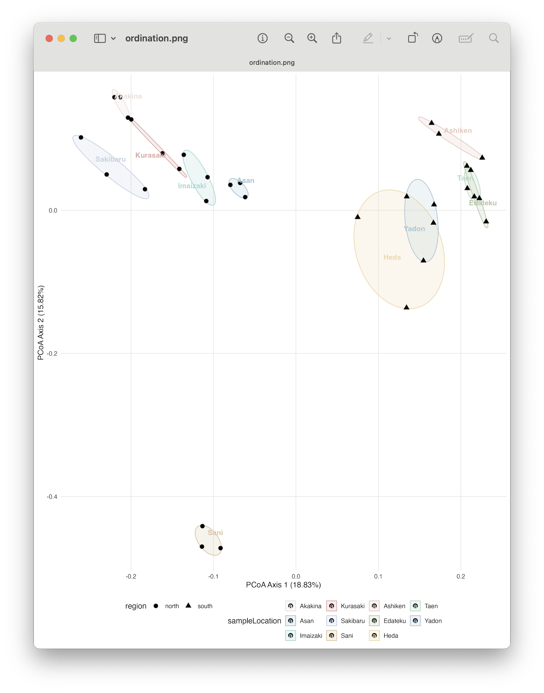
Fig. 81 : The PCoA plot whereby shapes provide information about the region (north vs south) and colour indicates sampling location. 95% confidence ellipses are drawn around each location.#
From the ordination plot, we can clearly see a split in the north region samples with the south region samples along the primary axis explaining 18.83% of the variation in the data. Furthermore, Sani separates on the secondary axis from all other samples, which makes sense when we think back about our alpha diversity observations where this site showed a significant increased SR and Faith’s PD compared to other samples.
4.3 PERMANOVA#
While ordination is a great way to visualise differences in species community composition between samples, it does not provide a p-value to determine if those differences are significant. To check if the differences between groups are significant, we can run a PERMANOVA or PERmutational Multivariate Analysis of VAriance. The PERMANOVA procedure works by using permutation testing. Here’s a basic outline of how it works:
Data Setup: You have a dataset with multiple variables (multivariate) and multiple groups or conditions.
Dissimilarity Matrix: A dissimilarity matrix is created based on the multivariate data. This matrix quantifies the dissimilarity or distance between individual observations within the dataset (here you could pick what matrix you would like to use, in our example we are using a unweighted UniFrac matrix as we are investigating PD).
Permutation Testing: PERMANOVA works by shuffling the group labels (permuting) and then recalculating the dissimilarity matrix and relevant statistical tests. This process is repeated many times to create a distribution of test statistics under the assumption that the group labels have no effect on the data.
Comparison to Observed Data: The observed test statistic (usually a sum of squares or sums of squared distances) is then compared to the distribution of test statistics generated through permutation testing. This comparison helps determine the likelihood of observing the observed test statistic if the group labels have no effect.
P-Value Calculation: The p-value is calculated as the proportion of permuted test statistics that are more extreme than the observed test statistic. A low p-value indicates that the observed differences between groups are unlikely to occur by random chance alone.
Interpretation: If the p-value is below a pre-defined significance level (e.g., 0.05), you can then conclude that there are statistically significant differences between the groups based on the multivariate data.
## conduct PERMANOVA, pairwiseAdonis, and PERMDISP for statistical analysis of beta-diversity
adonis2(total_unifrac_distance ~ sampleLocation, data = metadata, permutations = 10000, strata = metadata$region)
Output
Permutation test for adonis under reduced model
Blocks:  strata
Permutation: free
Number of permutations: 10000

adonis2(formula = total_unifrac_distance ~ sampleLocation, data = metadata, permutations = 10000, strata = metadata$region)
         Df SumOfSqs      R2      F    Pr(>F)
Model    10   3.2902 0.63422 3.8146 9.999e-05 ***
Residual 22   1.8975 0.36578
Total    32   5.1877 1.00000
---
Signif. codes:  0 ‘***’ 0.001 ‘**’ 0.01 ‘*’ 0.05 ‘.’ 0.1 ‘ ’ 1
The results show us that we have a highly significant result for our PERMANVA analysis. A PERMANOVA analysis, however, can provide significant p-values in three instances, including:
the centroids of the groups are placed differently in ordination space (i.e., we see that samples are spaced out in the ordination plot), or
the dispersion of points between groups is different (i.e., some samples within a location cluster more closely together than others in the ordination plot), or
both.
4.4 PERMDISP#
To verify if our PERMANOVA analysis is significant due to point placement in ordination space, we have to exclude the other option (point dispersal). We can use the PERMDISP test to exclude a significant PERMANOVA due to point dispersal, as it provides a significant p-value only when points are dispersed differently between groups within the ordination space.
permutest(betadisper(as.dist(total_unifrac_distance), metadata$sampleLocation), permutations = 10000)
permutest(betadisper(as.dist(total_unifrac_distance), metadata$sampleLocation), permutations = 10000, pairwise = TRUE)
boxplot(betadisper(as.dist(total_unifrac_distance), metadata$sampleLocation))
Output
> permutest(betadisper(as.dist(total_unifrac_distance), metadata$sampleLocation), permutations = 10000)

Permutation test for homogeneity of multivariate dispersions
Permutation: free
Number of permutations: 10000

Response: Distances
          Df   Sum Sq   Mean Sq      F N.Perm Pr(>F)
Groups    10 0.034349 0.0034349 2.1148  10000 0.0178 *
Residuals 22 0.035732 0.0016242
---
Signif. codes:  0 ‘***’ 0.001 ‘**’ 0.01 ‘*’ 0.05 ‘.’ 0.1 ‘ ’ 1
> permutest(betadisper(as.dist(total_unifrac_distance), metadata$sampleLocation), permutations = 10000, pairwise = TRUE)

Permutation test for homogeneity of multivariate dispersions
Permutation: free
Number of permutations: 10000

Response: Distances
          Df   Sum Sq   Mean Sq      F N.Perm Pr(>F)
Groups    10 0.034349 0.0034349 2.1148  10000 0.0133 *
Residuals 22 0.035732 0.0016242
---
Signif. codes:  0 ‘***’ 0.001 ‘**’ 0.01 ‘*’ 0.05 ‘.’ 0.1 ‘ ’ 1

Pairwise comparisons:
(Observed p-value below diagonal, permuted p-value above diagonal)
           Akakina      Asan  Imaizaki  Kurasaki  Sakibaru      Sani   Ashiken   Edateku      Heda      Taen  Yadon
Akakina            0.6357364 0.6453355 0.4788521 0.0091991 0.0188981 0.6239376 0.0663934 0.2092791 0.7999200 0.9348
Asan     0.5690470           0.3991601 0.3035696 0.0366963 0.0533947 0.9643036 0.3036696 0.1744826 0.8815118 0.6359
Imaizaki 0.5863010 0.3831860           0.8888111 0.0937906 0.1404860 0.4158584 0.0596940 0.2527747 0.5800420 0.5564
Kurasaki 0.4410672 0.3056426 0.8620902           0.1016898 0.1707829 0.3174683 0.0464954 0.2649735 0.4645535 0.3614
Sakibaru 0.0124888 0.0445828 0.1119137 0.1238103           0.3085691 0.0504950 0.0049995 0.4093591 0.0634937 0.0017
Sani     0.0247223 0.0620870 0.1747119 0.2021185 0.3144030           0.0708929 0.0043996 0.3711629 0.0917908 0.0044
Ashiken  0.5686511 0.9553831 0.3942418 0.3229773 0.0620783 0.0827042           0.4036596 0.1712829 0.8565143 0.6387
Edateku  0.0806686 0.3102005 0.0718706 0.0526614 0.0051440 0.0072874 0.3791155           0.1135886 0.2460754 0.0530
Heda     0.2322856 0.2020593 0.2690904 0.2814472 0.3897512 0.3666098 0.2002524 0.1405126           0.1904810 0.2050
Taen     0.7567119 0.8553476 0.5195997 0.4298315 0.0787828 0.1071489 0.8238599 0.2633165 0.2181424           0.8266
Yadon    0.9165883 0.5794008 0.5055263 0.3561178 0.0017924 0.0057842 0.5805514 0.0662974 0.2273318 0.7826934
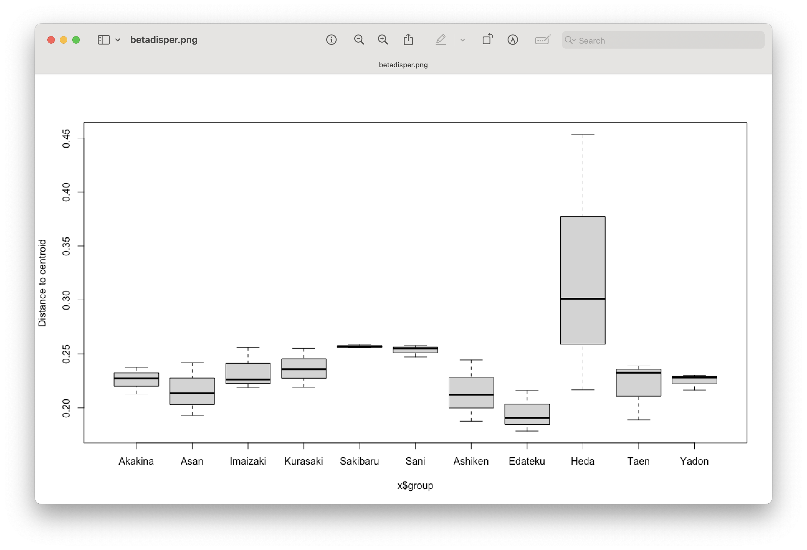
Fig. 82 : Boxplot showing difference in sample dispersion in ordination space between locations.#
From the PERMDISP analysis, we can see that we have a slightly significant result. Hence, we cannot say that our PERMANOVA was significant due to point placement. Furthermore, we need to be careful with interpreting the PERMANOVA results, as one of the assumptions (equal dispersal) was violated.
4.5 Indicator Species Analysis#
To determine which signals are contributing to the difference observed in our ordination and PERMANOVA analysis, we can run an Indicator Species Analysis (ISA) using the indicspecies R package. The Indicator Value (IndVal) is a simple calculation based on the specificity (occurring only in one group or multiple) and fidelity (how frequently is it detected in each group). We can specify indvalcomp = TRUE in the summary to provide the information about the specificity (component A) and fidelity (component B). For the tutorial data, we will restrict the indicator species as the ones with perfect specificity (At=1.0) and fidelity (Bt=1.0).
## run indicator species analysis
indval <- multipatt(beta_table_clean_pa, metadata$region, control = how(nperm = 9999))
summary(indval, indvalcomp = TRUE, At=1.0, Bt=1.0)
Output
 Multilevel pattern analysis
 ---------------------------

 Association function: IndVal.g
 Significance level (alpha): 0.05
 Minimum positive predictive value (At): 1
 Minimum sensitivity (Bt): 1

 Total number of species: 1695
 Selected number of species: 2
 Number of species associated to 1 group: 2

 List of species associated to each combination:

 Group south  #sps.  2
        A B stat p.value
ASV_257 1 1    1   1e-04 ***
ASV_324 1 1    1   1e-04 ***
---
Signif. codes:  0 ‘***’ 0.001 ‘**’ 0.01 ‘*’ 0.05 ‘.’ 0.1 ‘ ’ 1
The output shows only 2 ASVs which have perfect specificity and fidelity for the south region, while no ASVs were observed with such characteristics for the north region. This, however, is to be expected, as the north vs south grouping was not observed in the ordination analysis. Hence, we would not expect a lot of ASVs to show perfect specificity and fidelity for the two regions.
Finally, looping over the indicator species taxonomic IDs will provide information on which signals were deemed as indicative of the south region.
## loop over taxonomy to explore indicator species
for (item in c('ASV_257', 'ASV_324')) {
  print(taxonomy[item, ])
}
Output
        kingdom   phylum class     order     family   genus          species pident qcov matching species IDs sequence_length final_read_count
ASV_257    <NA> Oomycota  <NA> Pythiales Pythiaceae Pythium Pythium_aquatile 80.399   94     Pythium aquatile             313             1028
        pct_reads occurrence_count pct_occurrence
ASV_257      0.03               15          45.45
        kingdom   phylum class          order          family        genus species pident qcov
ASV_324    <NA> Oomycota  <NA> Peronosporales Peronosporaceae Phytophthora    <NA> 84.127   99
                                                         matching species IDs sequence_length final_read_count pct_reads occurrence_count
ASV_324 Phytophthora niederhauseri, Phytophthora vignae, Phytophthora melonis             313              710      0.02               15
        pct_occurrence
ASV_324          45.45
We will leave it at this for the introduction to the statistical analysis of metabarcoding data, as well as the full tutorial. We hope this workshop will benefit your research. Please feel free to contact me for any questions at gjeunen@gmail.com.