Phylogenetic tree#
Before conducting the statistical analysis, there is one last output file we can create to help us explore our data, a phylogenetic tree of the ZOTU sequences. Phylogenetic relatedness is commonly used to inform downstream analyses, especially the calculation of phylogeny-aware distances. We can create the phylogenetic tree in R. Therefore, let’s open a new R script and save it as sequenceData/1-scripts/phylotree.R. We can copy-paste the R code below into this script to run all the code.
First, let’s set up the R environment by setting the working directory and loading all the necessary R packages.
#########################
# PREPARE R ENVIRONMENT #
#########################
library(msa)
library(ape)
library(ade4)
library(scales)
library(basetheme)
library(Biostrings)

# set working directory
setwd('/Users/gjeunen/Documents/work/lectures/HKU2023/tutorial/sequenceData/8-final')
1. Reading/Parsing data#
To generate the phylogenetic tree file, we need to import the ZOTU sequence file (sequenceData/8-final/zotusFiltered.fasta) and the taxonomy assignment file (sequenceData/8-final/taxonomyFiltered.txt) into R. Once the files are read into R, we can explore the sequence file and make sure the names between both files match.
##################
# READ DATA IN R #
##################
dna <- readDNAStringSet('zotusFiltered.fasta')
taxonomy <- read.table('taxonomyFiltered.txt', header = TRUE, sep = '\t', fill = TRUE, na.strings = c('', 'NA'), row.names = 1)

# explore data sets
dna
all(taxonomy$ID == rownames(dna))
table(taxonomy$phylum)
table(taxonomy$class)
Output
> all(taxonomy$ID == rownames(dna))
[1] TRUE

> table(taxonomy$phylum)

       Annelida      Arthropoda Bacillariophyta         Bryozoa     Chlorophyta        Chordata        Cnidaria
            198             427               7              27               1              19              33
       Discosea   Echinodermata      Entoprocta   Eukaryota_nan    Gastrotricha        Mollusca        Nematoda
              1              15               2               9               6              71               6
       Nemertea Platyhelminthes        Porifera      Rhodophyta      Tardigrada
              7               9              11              15               1

> table(taxonomy$class)

        Actinopteri            Amphibia        Annelida_nan            Anthozoa           Arachnida
                 11                   1                   6                  10                  30
     Arthropoda_nan          Ascidiacea                Aves   Bacillariophyceae            Bivalvia
                  2                   1                   1                   2                  16
       Branchiopoda         Bryozoa_nan         Cephalopoda           Chilopoda         Chromadorea
                  2                   2                   1                   4                   2
         Clitellata          Collembola Coscinodiscophyceae        Demospongiae           Diplopoda
                 11                   6                   4                  11                   8
       Discosea_nan              Enopla             Enoplea      Entoprocta_nan   Eukaryota_nan_nan
                  1                   4                   4                   2                   5
    Florideophyceae          Gastropoda    Gastrotricha_nan        Gymnolaemata    Heterotardigrada
                 15                  53                   6                  25                   1
        Hexanauplia            Hydrozoa             Insecta        Malacostraca            Mammalia
                101                  23                 157                 103                   5
       Mediophyceae        Nemertea_nan         Ophiuroidea           Ostracoda      Palaeonemertea
                  1                   1                  15                   1                   1
       Phaeophyceae        Pilidiophora          Polychaeta      Polyplacophora Pyramimonadophyceae
                  4                   1                 176                   1                   1
      Rhabditophora           Sipuncula         Thecostraca
                  9                   5                  13

Fig. 39 : The R output of the DNA string set#
2. Calculating MSA#
Once the data is read into memory, we can calculate the multiple sequence alignment using ClustalW from the msa R package.
Important
Generating a multiple sequence alignment from a small DNA fragment (~313 bp) of such a large data set containing a very broad range of taxonomic groups is incredibly complex and near-impossible. Using standard settings, the alignment will most likely end up nonsensical with a length of thousands of basepairs. To circumvent this issue, we will subset the data into taxonomic groups of interest. For our tutorial data, let’s generate a simple phylogenetic tree for the phylum Cnidaria.
#######
# MSA #
#######
# 1. subset the data for the phylum Cnidaria
taxonomyCnidaria <- subset(taxonomy, phylum == 'Cnidaria')
dnaCnidaria <- dna[rownames(taxonomyCnidaria)]

# 1. run MSA for Cnidaria
multCnidaria <- msa(dnaCnidaria, method = 'ClustalW', type = 'dna', order = 'input')
3. Distance-based phylogenies#
Distance-based phylogenetic reconstruction consists of (i) computing pairwise genetic distances between sequences, (ii) representing these distances using a tree, and (iii) evaluating the relevance of this representation.
3.1 Computing distances#
We first compute genetic distances using the dist.dna function in the ape R package. This package contains more than 15 different genetic distance models (see ?dist.dna for details). Here, we use Tamura and Nei 1993’s model, which allows for different rates of transitions and transversions, heterogeneous base frequencies, and between-site variation of the substitution rate.
#########################
# CALCULATING DISTANCES #
#########################
# 1. distance calculation for Cnidaria
multConvertCnidaria <- msaConvert(multCnidaria, 'ape::DNAbin')
distanceCnidaria <- dist.dna(multConvertCnidaria, model = 'TN93')
class(distanceCnidaria)
length(distanceCnidaria)
temp <- as.data.frame(as.matrix(distanceCnidaria))
table.paint(temp, cleg = 0, clabel.row = 0.5, clabel.col = 0.5)
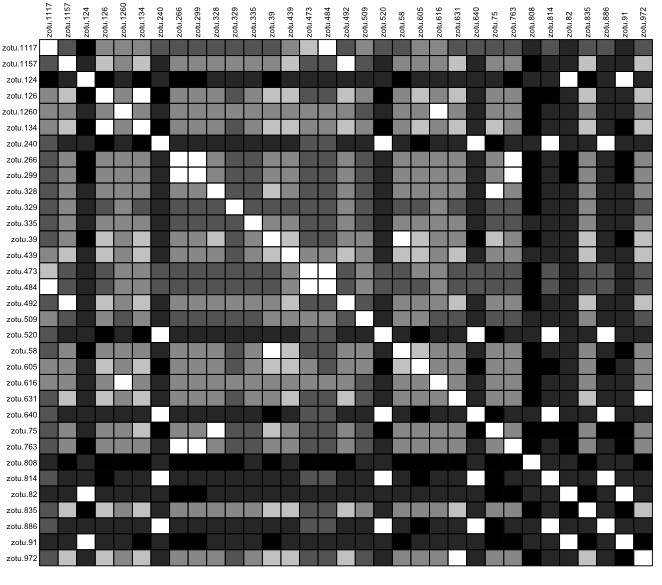
Fig. 40 : Genetic distance visualisation for the phylum Cnidaria.#
3.2 Building trees#
We use trees to get a better representation of the genetic distances between sequences. It is important, however, to bear in mind that the obtained trees are not necessarily an efficient representation of the original distances, and information can - and likely will - be lost in the process. A wide array of algorithms for constructing trees from a distance matrix are available. In this tutorial, we will use the classical Neighbour-joining algorithm.
##################
# BUILDING TREES #
##################
# 1. for Cnidaria
treeCnidaria <- nj(distanceCnidaria)
class(treeCnidaria)
treeCnidaria
plot(treeCnidaria, cex = 0.6)
title('A simple NJ tree of the phylum Cnidaria')
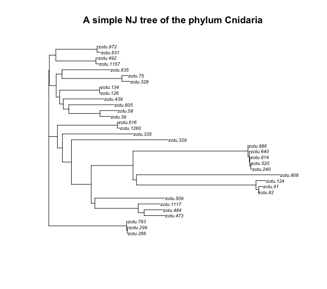
Fig. 41 : A simple NJ tree of the phylum Cnidaria#
We can see that the tree is plotted with the ZOTU labels. This makes it difficult to check if the tree makes any sense, since the ZOTU labels do not provide any information about the taxonomic ID. We can change this by changing the tip labels with a taxonomic ID name. Let’s use the class IDs for the phylum Mollusca and the order IDs for the class Malacostraca.
# 1. plot tree with colored labels for Cnidaria
plot(treeCnidaria, show.tip = FALSE)
title('Unrooted NJ tree for the phylum Cnidaria')
tiplabels(taxonomyCnidaria$class, bg = lab2col(taxonomyCnidaria$class), cex = 0.5)
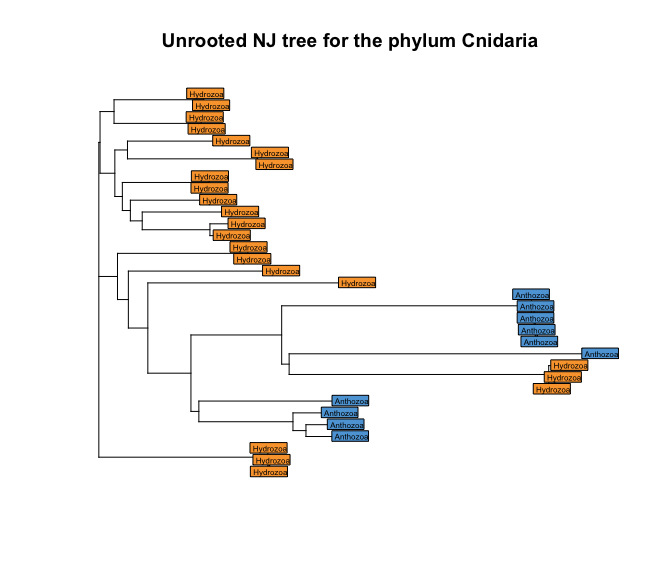
Fig. 42 : A simple NJ tree of the phylum Cnidaria with coloured tip labels based on the taxonomic ID at the class level.#
The results are a bit messed up in our trees it seems, with classes mixed together in the tree. However, we need to keep in mind that we currently have created an unrooted tree. The default plot view, though, is rooted. We can check if our tree is rooted or not by using the function is.rooted.
# 1. check if tree is rooted
is.rooted(treeCnidaria)
Output
# 1. check if tree is rooted
is.rooted(treeCnidaria)
[1] FALSE
So, a better representation of our tree would be to specify type = 'unrooted' in our plot command.
# 1. plot unrooted tree
plot(treeCnidaria, type = 'unrooted', show.tip = FALSE)
title('Unrooted NJ tree of phylum Cnidaria')
tiplabels(taxonomyCnidaria$class, bg = lab2col(taxonomyCnidaria$class), cex = 0.5)
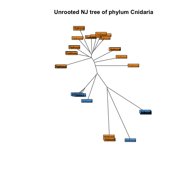
Fig. 43 : Unrooted NJ tree of the phylum Cnidaria with coloured tip labels based on the taxonomic ID at the class level.#
To explore our data set through a phylogenetic tree, it is easiest to work on a rooted tree however. To root the tree, we can use a simple “hack”, where we set one of the Anthozoa sequences as outgroup. Check the taxnoomy data frame at which row number an Anthozoa sequence is located. In our case, ZOTU 1117 in row 1 is assigned an anthazoan taxonomic ID.
# 1. set root of tree as Anthozoa ZOTU 1117 (row 1)
treeCnidaria2 <- root(treeCnidaria, out = 1)
plot(treeCnidaria2, show.tip = FALSE, edge.width = 2)
title('Rooted NJ tree for phylum Cnidaria')
tiplabels(taxonomyCnidaria$class, bg = lab2col(taxonomyCnidaria$class), cex = 0.5, fg = 'transparent')
axisPhylo()
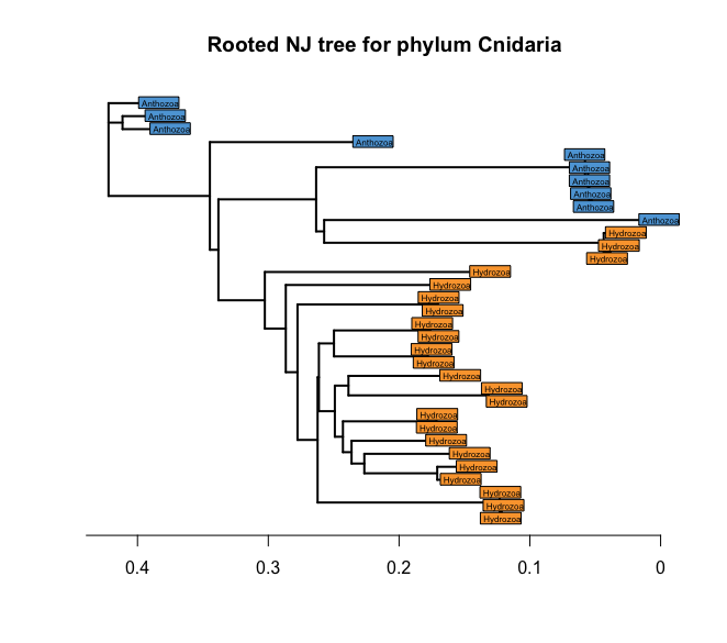
Fig. 44 : Rooted NJ tree of the phylum Cnidaria with coloured tip labels based on the taxonomic ID at the class level.#
This is looking much better already! However, there is this one group that isn’t as resolved as it should be between the Anthozoa and the Hydrozoa. We can change the labels to plot the quality of the BLAST hit and keep the colour of the taxonomic class ID to determine if mis-classification might have occurred. So, let’s plot the tree again with these new labels.
# 1. combine the percent identity and query coverage columns, 2. set root of tree as Anthozoa ZOTU 1117 (row 1)
cols <- c('pident', 'qcov')
taxonomyCnidaria$taxqual <- apply(taxonomyCnidaria[, cols], 1, paste, collapse = '__')
treeCnidaria3 <- root(treeCnidaria, out = 1)
plot(treeCnidaria3, show.tip = FALSE, edge.width = 2)
title('Rooted NJ tree for phylum Cnidaria')
tiplabels(taxonomyCnidaria$taxqual, bg = lab2col(taxonomyCnidaria$class), cex = 0.5, fg = 'transparent')
axisPhylo()
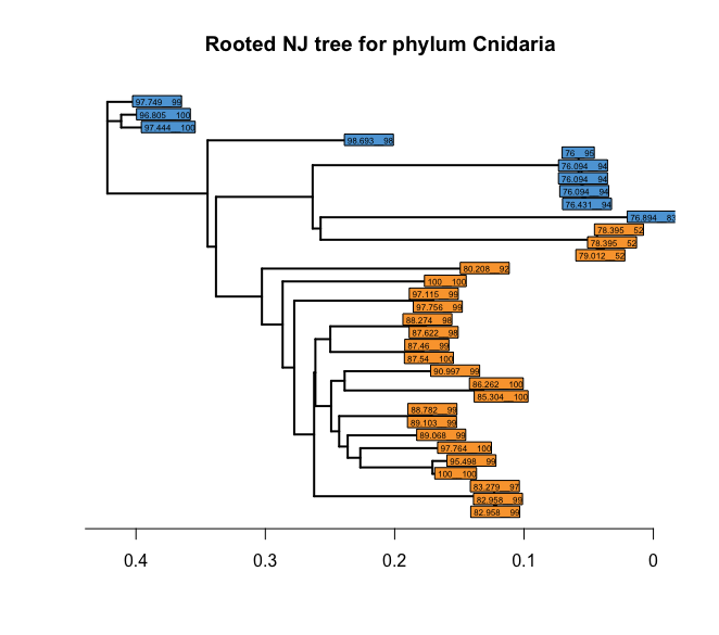
Fig. 45 : Rooted NJ tree of the phylum Cnidaria with coloured tips based on the taxonomic ID at the class level and labels based on the quality of the BLAST hit.#
From the output, we can see that the badly resolved section of the tree, based on the BLAST taxonomic ID, all contain low scores for the BLAST hits, indicating the potential for mis-classification. For your project, you might want to consider removing such signals when using a taxonomic-dependent analysis or, instead, use a taxonomic-independent analysis approach. For this tutorial, we’ll keep the tree as it is and move forward to the next section.
3.3 Tree quality#
Many genetic distances and hierarchical clustering algorithms can be used to build trees; not all of them are appropriate for a given dataset. Genetic distances rely on hypotheses about the evolution of DNA sequences, which should be taken into account. Once you have chosen an appropriate genetic distance and built a tree using this distance, an essential but yet most often overlooked question is whether this tree is actually a good representation of the original distance matrix. This is easily investigated using simple biplots and correlation indices. The function cophenetic is used to compete distances between the tips of the tree. Note that more distances are availabe in the adephylo R pacakge and distTips function.
################
# TREE QUALITY #
################
x <- as.vector(distanceCnidaria)
y <- as.vector(as.dist(cophenetic(treeCnidaria2)))
plot(x, y, xlab = 'original distance', ylab = 'distance in the tree',
     main = 'Is NJ appropriate?', pch = 20, col = alpha('black', 0.4), cex = 0.3)
abline(lm(y ~ x), col = 'red')
cor(x, y)^2
Output
> cor(x, y)^2
[1] 0.9697193
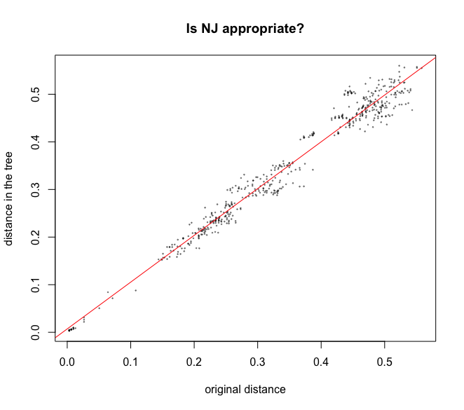
Fig. 46 : Biplot and correlation analysis of the quality of the tree with the original distance matrix values on the x-axis and the distance on the tree on the y-axis.#
In our case, we can see that this simple Neighbour Joining tree we created for the phylum Cnidaria in our data set is a good representation of the initial distance matrix, with an R2-value of 0.97.
4. Exporting trees#
Once we have created the phylogenetic tree, we can export the tree in Newick format to save it using the R code below.
###############
# EXPORT TREE #
###############
ape::write.tree(treeCnidaria2, file = 'njTreeCnidaria.txt')
5. Intro to data visualization#
With this tree we just created, we can start exploring our data set. There are many elaborate ways of exploring your data and creating stunning visualisations. However, most of this will be outside the scope of this tutorial. Today, we will show you how to add other data types to the phylogenetic tree, whereby we will look at differences in detection of the Cnidaria sequences between highly and low-impacted sites. The R package we will be using to generate such figures is ggtree, which was developed by Prof. Guangchaung Yu at the University of Hong Kong. For a lot more information to create more elaborate figures and details on the ggtree package, I recommend starting with this book.
5.1 Reading data into R#
The first thing we need to do is read our files into the R environment, as well as some R packages. Next, we need to subset our data to only include Cnidarian sequences, as this is what our phylogenetic tree is based on. Last, we can import our data frames into one phyloseq object.
#########################
# PREPARE R ENVIRONMENT #
#########################
library(ggtree)
library(phyloseq)
library(Biostrings)
library(speedyseq)
library(microbiome)
library(tidyverse)
library(ggplot2)
library(egg)

# set working directory
setwd('/Users/gjeunen/Documents/work/lectures/HKU2023/tutorial/sequenceData/8-final')

##################
# READ DATA IN R #
##################
metaData <- read.table('../0-metadata/sampleMetadataFiltered.txt', header = TRUE, sep = '\t', row.names = 1, check.names = FALSE, comment.char = '')
freqTable <- read.table('zotutableFiltered.txt', header = TRUE, sep = '\t', row.names = 1, check.names = FALSE, comment.char = '')
sequenceTable <- readDNAStringSet('zotusFiltered.fasta')
phyloTree <- read.tree('njTreeCnidaria.txt')
taxonomyTable <- read.table('taxonomyFiltered.txt', header = TRUE, sep = '\t', row.names = 1, check.names = FALSE, comment.char = '')

###############
# SUBSET DATA #
###############
taxonomyCnidaria <- subset(taxonomyTable, phylum == 'Cnidaria')
sequenceCnidaria <- sequenceTable[rownames(taxonomyCnidaria)]
freqTableCnidaria <- freqTable[rownames(taxonomyCnidaria), ]

# 1. import dataframes into phyloseq
OTU = otu_table(freqTableCnidaria, taxa_are_rows = TRUE)
TAX = tax_table(as.matrix(taxonomyCnidaria))
META = sample_data(metaData)
physeq = merge_phyloseq(OTU, TAX, META, phyloTree, sequenceTable)
physeq
Output
> physeq
phyloseq-class experiment-level object
otu_table()   OTU Table:         [ 33 taxa and 24 samples ]
sample_data() Sample Data:       [ 24 samples by 32 sample variables ]
tax_table()   Taxonomy Table:    [ 33 taxa by 9 taxonomic ranks ]
phy_tree()    Phylogenetic Tree: [ 33 tips and 31 internal nodes ]
refseq()      DNAStringSet:      [ 33 reference sequences ]
5.2 Visualise tree#
Now that we have all our data imported into R and phyloseq objects, let’s visualise our phylogenetic tree using ggtree.
#####################
# PHYLOGENETIC TREE #
#####################
# 1. create phylogenetic tree
ptree <- ggtree(phyloTree) +
  geom_tiplab(size = 2, align = TRUE, linesize = 0.5, ladderize = FALSE) +
  theme_tree2()
ptree
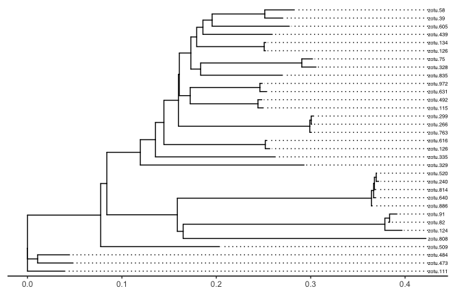
Fig. 47 : Basic plot of the phylogenetic tree of the phylum Cnidaria using the ggtree R package.#
5.3 Data massaging#
For the plot we want to create, i.e., a multiple bar graph showing differences in Cnidaria detection between high and low impacted sites, we do not need to differentiate between size fractions. Therefore, let’s merge the 100 µm and 500 µm samples originating from the same ARMS. Afterwards, we can transform the data to presence-absence, as we would like to determine detection frequency differences between the sites.
# 1. merge different size fractions of the same ARMS, 2. transform data to presence-absence
physeq.arms <- merge_samples2(physeq, 'ARMS_ID')
physeq.arms.pa <- microbiome::transform(physeq.arms, 'pa')
Output
> physeq.arms.pa
phyloseq-class experiment-level object
otu_table()   OTU Table:          [ 33 taxa and 12 samples ]:
sample_data() Sample Data:        [ 12 samples by 32 sample variables ]:
tax_table()   Taxonomy Table:     [ 33 taxa by 9 taxonomic ranks ]:
phy_tree()    Phylogenetic Tree:  [ 33 tips and 31 internal nodes ]:
refseq()      DNAStringSet:       [ 33 reference sequences ]
taxa are rows
5.4 Bar plots#
Next, we can create separate bar plots for the low-impacted and the high-impacted sites. We need to make sure that the y-axis, which displays the ZOTU sequences, is in the same order as the tree. We can accomplish this through the get_taxa_name function in ggtree. Note that we have to reverse this order to make it match with the bar plot.
# 1. generate bar graph for low-impacted sites
lowColor = '#528B8B'
orderedTipLabels <- get_taxa_name(ptree)
physeq.arms.pa.low <- subset_samples(physeq.arms.pa, impact == 'low')
bar.freq.low <- physeq.arms.pa.low %>% psmelt() %>% as_tibble()
barfreq.low <- ggplot(data = bar.freq.low) +
  geom_bar(aes(y = OTU, x = Abundance, fill = impact), stat = 'identity', show.legend = FALSE) +
  scale_fill_manual(values = lowColor) +
  scale_y_discrete(limits = rev(orderedTipLabels)) +
  scale_x_continuous(limits = c(0, 6), expand = c(0, 0), breaks = c(0, 3, 6)) +
  theme_classic() +
  theme(axis.title.y = element_blank(), axis.text.y = element_blank(), axis.ticks.y = element_blank(), axis.line.y = element_blank())
barfreq.low
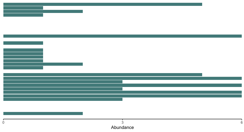
Fig. 48 : Bar plot of the low impacted sites.#
# 1. generate bar graph for high-impacted sites
highColor = '#CBDCDC'
orderedTipLabels <- get_taxa_name(ptree)
physeq.arms.pa.high <- subset_samples(physeq.arms.pa, impact == 'high')
bar.freq.high <- physeq.arms.pa.high %>% psmelt() %>% as_tibble()
barfreq.high <- ggplot(data = bar.freq.high) +
  geom_bar(aes(y = OTU, x = Abundance, fill = impact), stat = 'identity', show.legend = FALSE) +
  scale_fill_manual(values = highColor) +
  scale_y_discrete(limits = rev(orderedTipLabels)) +
  scale_x_continuous(limits = c(0, 6), expand = c(0, 0), breaks = c(0, 3, 6)) +
  theme_classic() +
  theme(axis.title.y = element_blank(), axis.text.y = element_blank(), axis.ticks.y = element_blank(), axis.line.y = element_blank())
barfreq.high
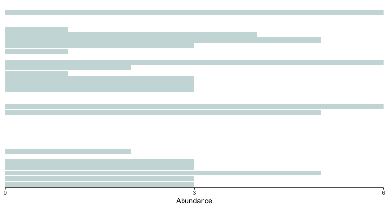
Fig. 49 : Bar plot of the high impacted sites.#
5.5 Combine all plots#
One final aspect is to combine all plots. We can easily do this using the egg R package, which allows us to specify the number of rows we want to plot (nrow) and the width of each plot (widths).
# 1. combine using egg
ggarrange(ptree, barfreq.low, barfreq.high, nrow = 1, widths = c(8, 1, 1))
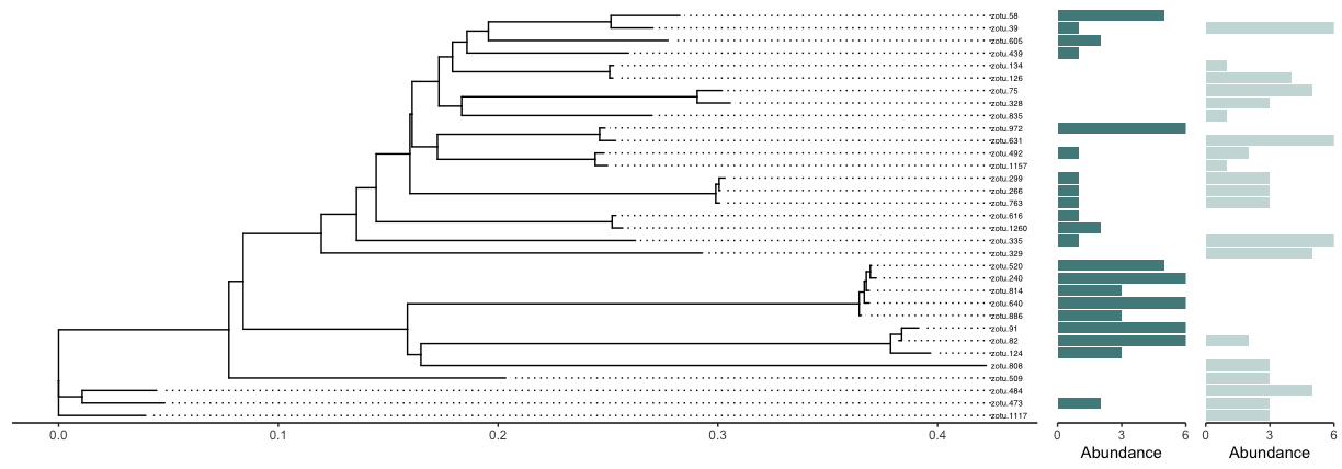
Fig. 50 : A combined plot showing the Cnidarian phylogenetic tree, as well as the detection frequency of each observed Cnidarian sequence for the low and high impacted sites.#
